Designing Zippi - A Digital Bridge Connecting Users, Local Stores & Those In-Between
Zippi had done their homework, they knew what they wanted and they had reference points for how things might work – in the form of other existing businesses such as instacart. The major issue was translating this to work for the Nigerian market and ensuring it worked well.
In order for this idea to work, there needed to be three parts to make the whole – the buyer part, the shopper part & the rider part.
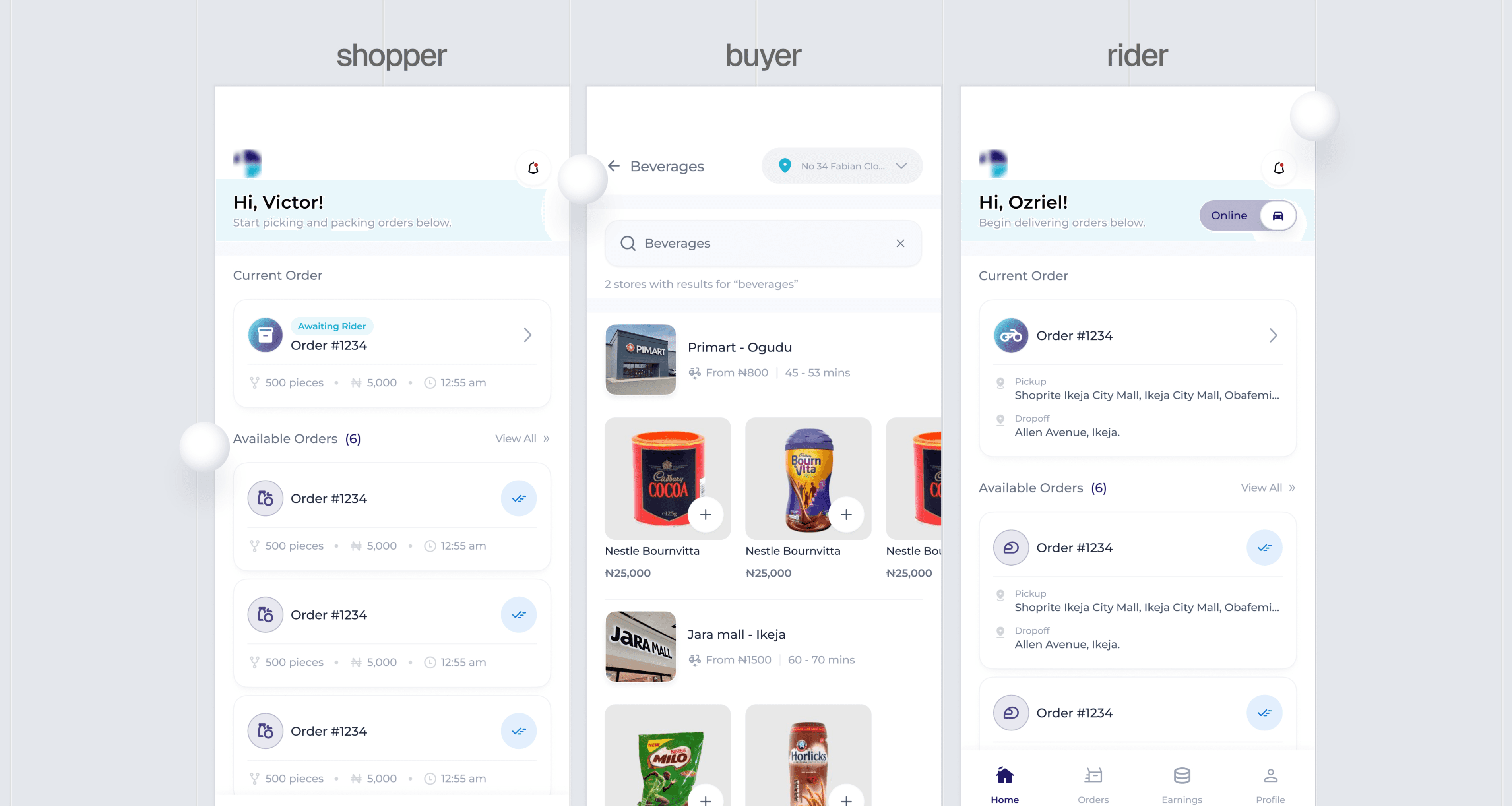
The Buyer.
This is the primary user – he/she who places an order then has it delivered to their home.
From the get-go, some features / needs of this user were clear:
They needed to be able to see what they wanted to order– meaning they needed to be able to view a lot of different things at a go.
They needed to be able to go from landing on the platform to checking out in minutes, if not seconds.
The idea was to get an MVP to the market as soon as was feasible, so we were on a deadline. Thus, rather than primary research, I conducted secondary ones.
Here, I found there are different types of buyers -
The buyer was our main focus—the person placing an order and expecting a smooth, timely delivery.
Early on, it was clear what they needed most: to easily browse a wide range of products and complete their orders in just a few minutes.
With a short deadline to get the MVP ready, I relied on secondary research to guide design decisions efficiently.
• Purpose-driven: those who know exactly what they want, e.g a bag of flour.
• Browsers: those who explore for potential purchases.
• Habitual & Bargainers: those who visit as part of a routine and those who visit for clearance items / deals.
• Emergency: those who visit to buy something they need urgently.
• Problem-solvers: those who visit to solve a problem rather than to buy a specific item e.g a person visiting a store because they need something quick and easy for dinner rather than for a specific dish.
A little architecture
When designing the interface, certain things had to be clear. In supermarkets / stores, goods/products are grouped in a certain manner with clear signs that help people navigate to what they need or might be interested in. This creates a mental model in people’s mind on how to find things in stores thereby allowing all of the buyers listed above to know how to navigate based on their needs.
All of these were important because the product’s interface & architecture needed to account for them, and so it did.
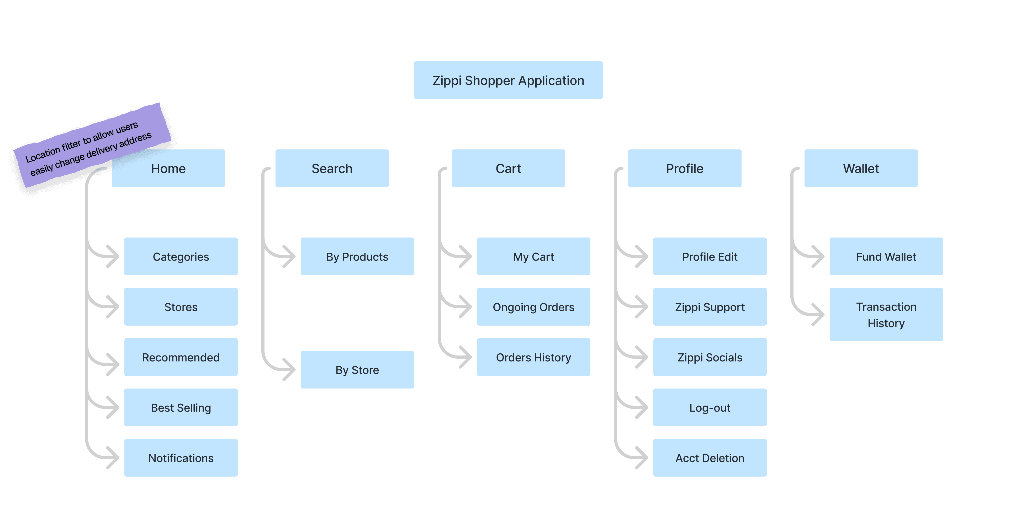
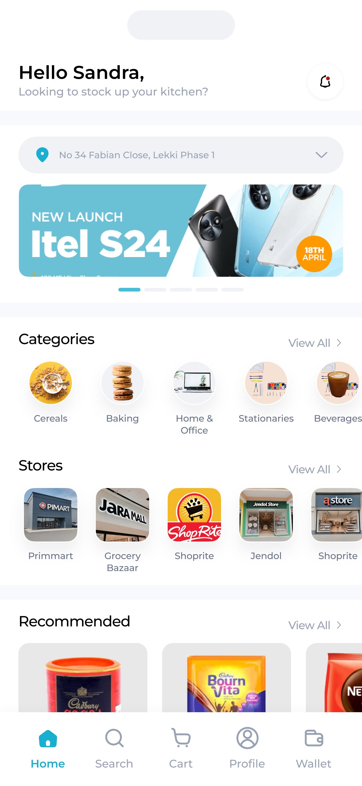
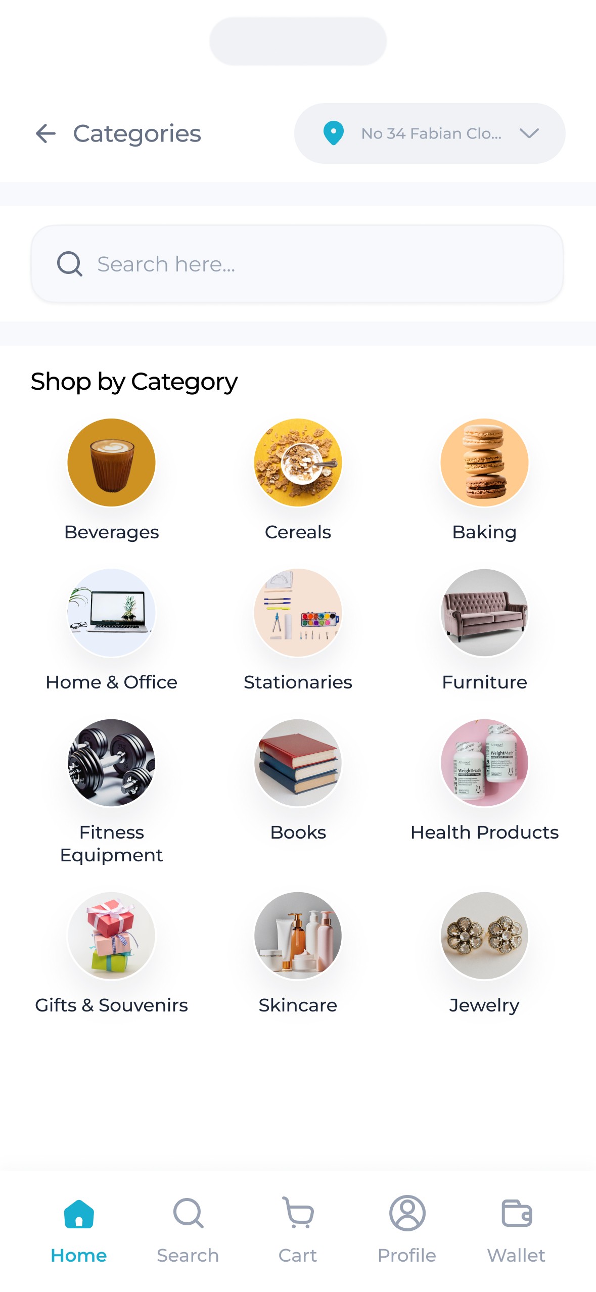
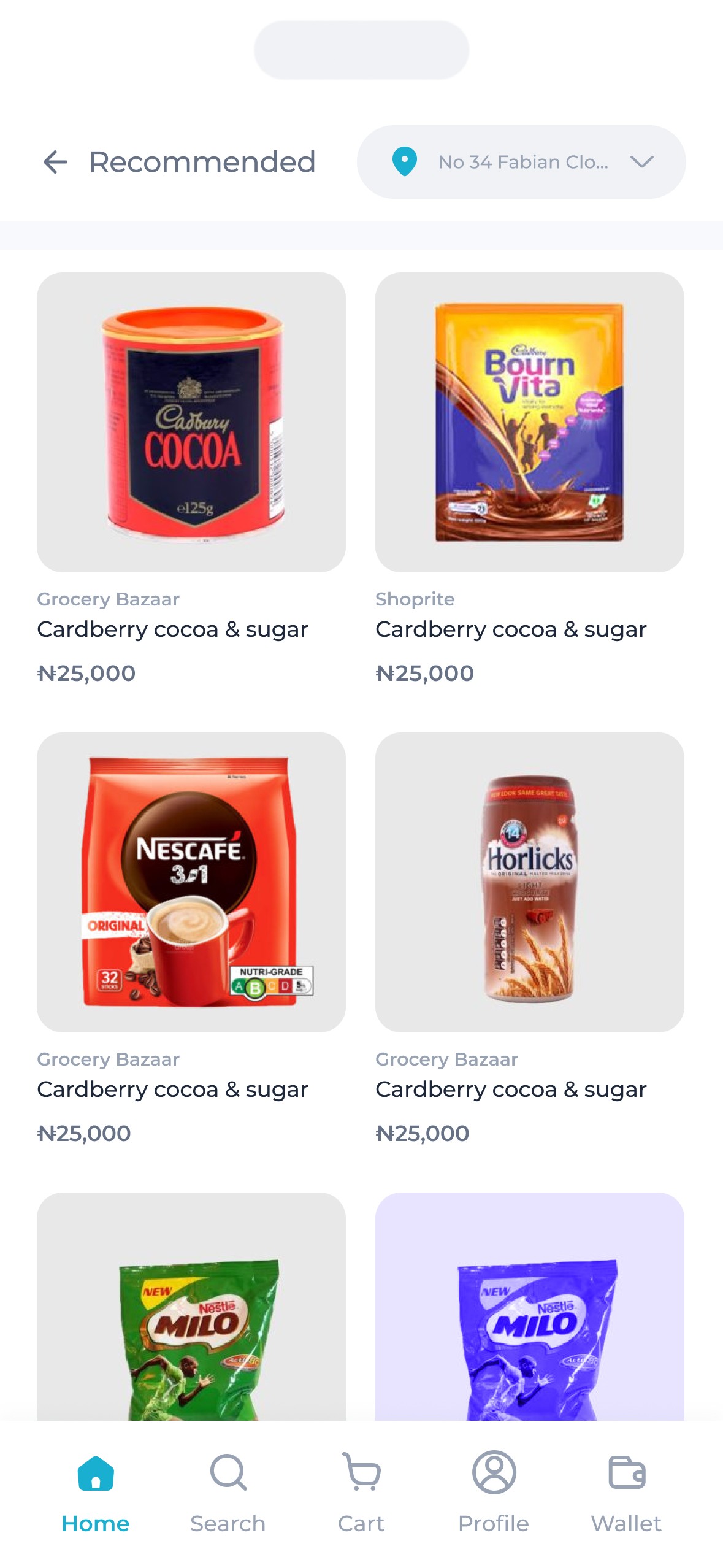
Right from the home page, products are grouped into various segments
Categories (e.g beverages, stationnaires, Baby products etc) that mimic what is already present at physical supermarkets accounting for the mental model buyers were used to.
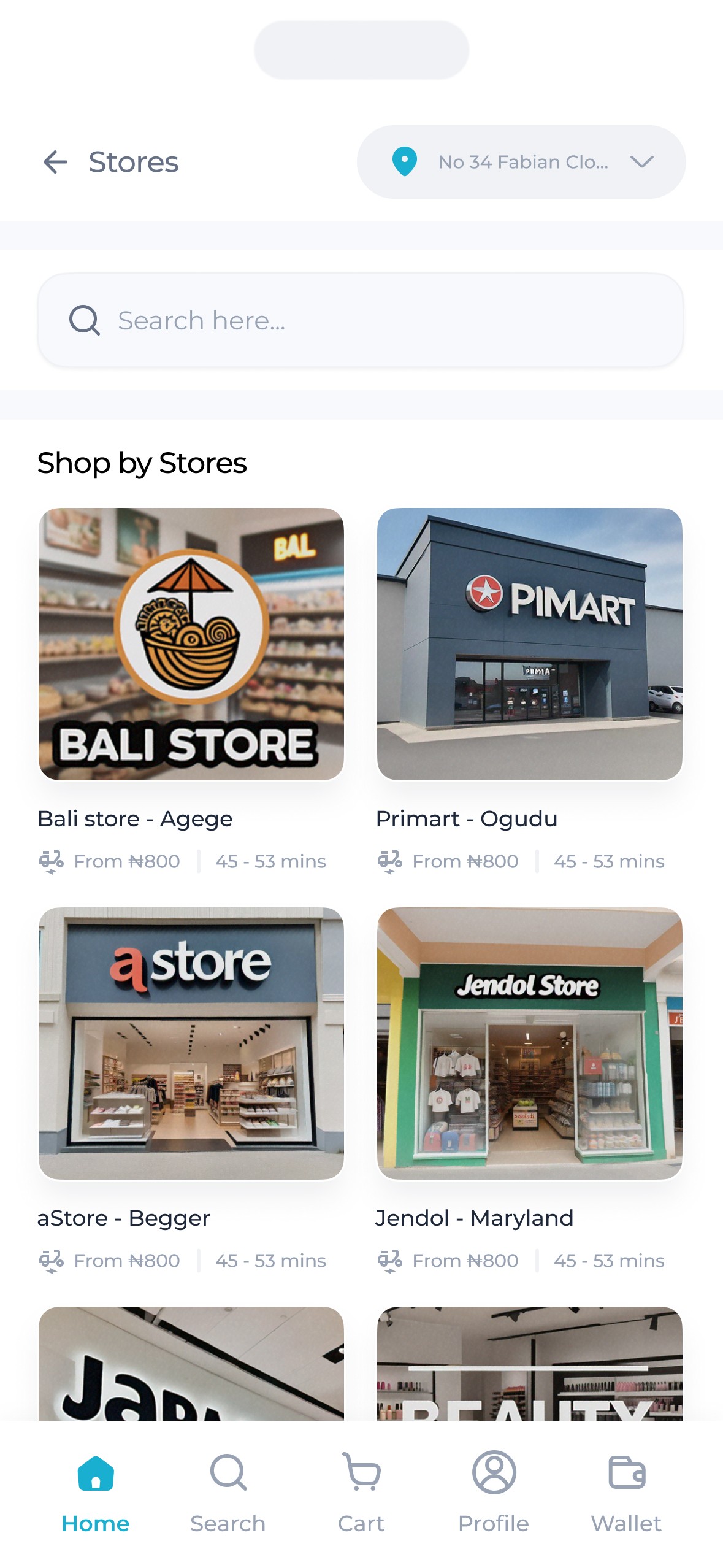
Stores were also shown in order of proximity with those closest to the users appearing first.
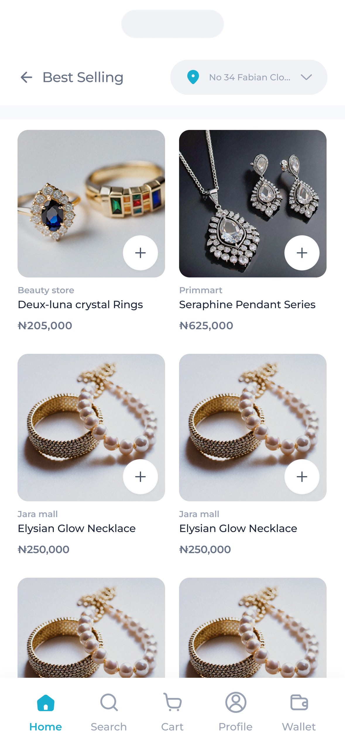
Recommended items followed, displaying recommendations based on users past purchases.
Finally, best selling items, which are items from those closest stores with the most sales in recent times & those that are currently going for a discount.
Also on the home page, are banners ads & the address bar to allow for prominent advertisement and a clear representation of set destinated address.
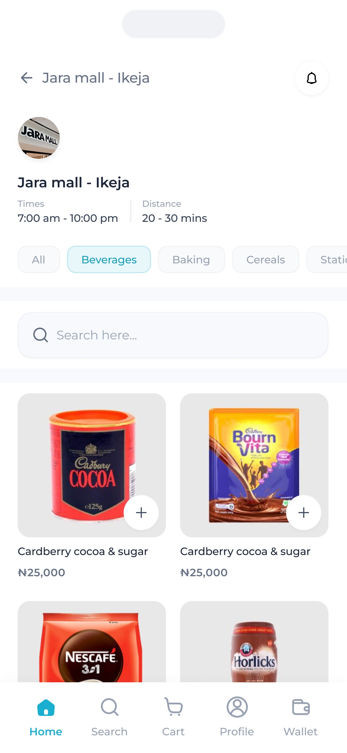
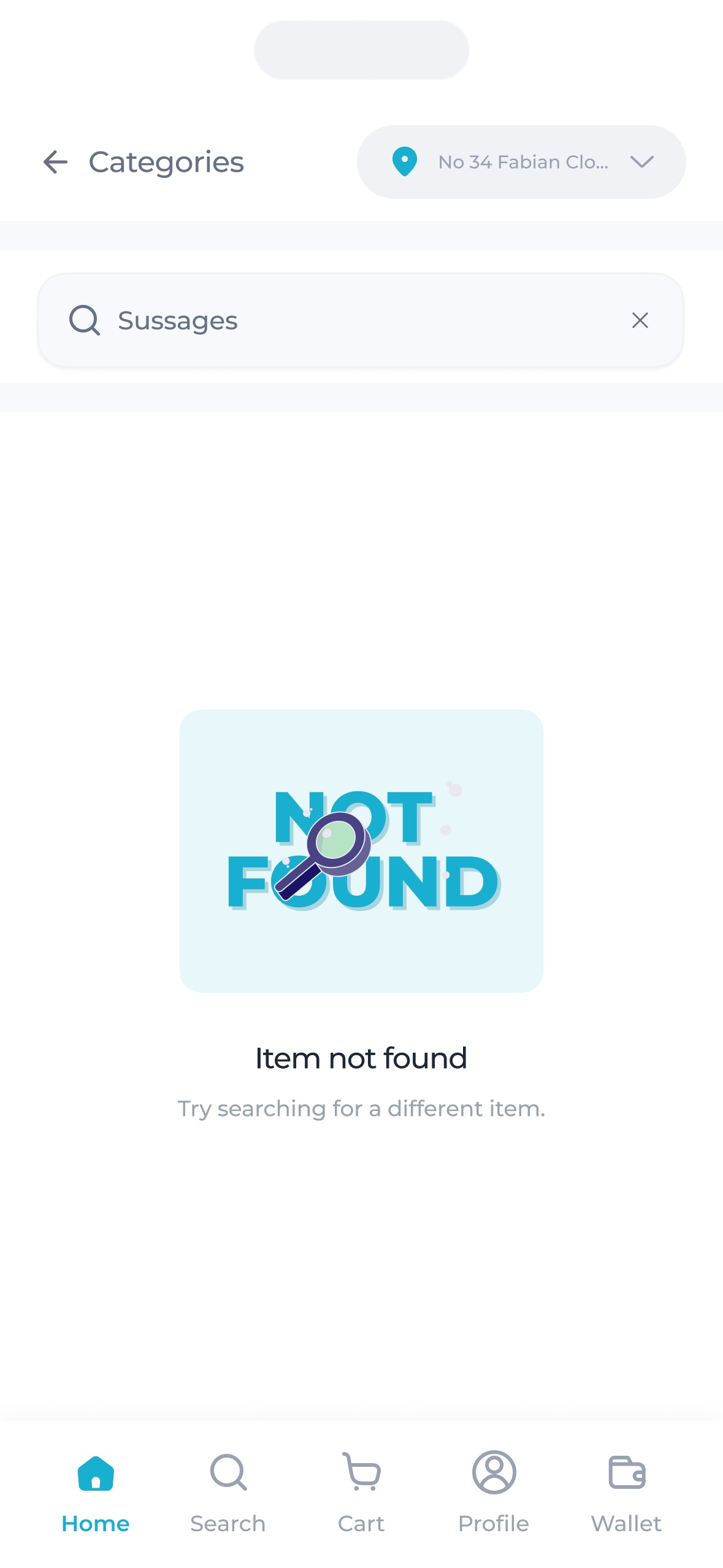
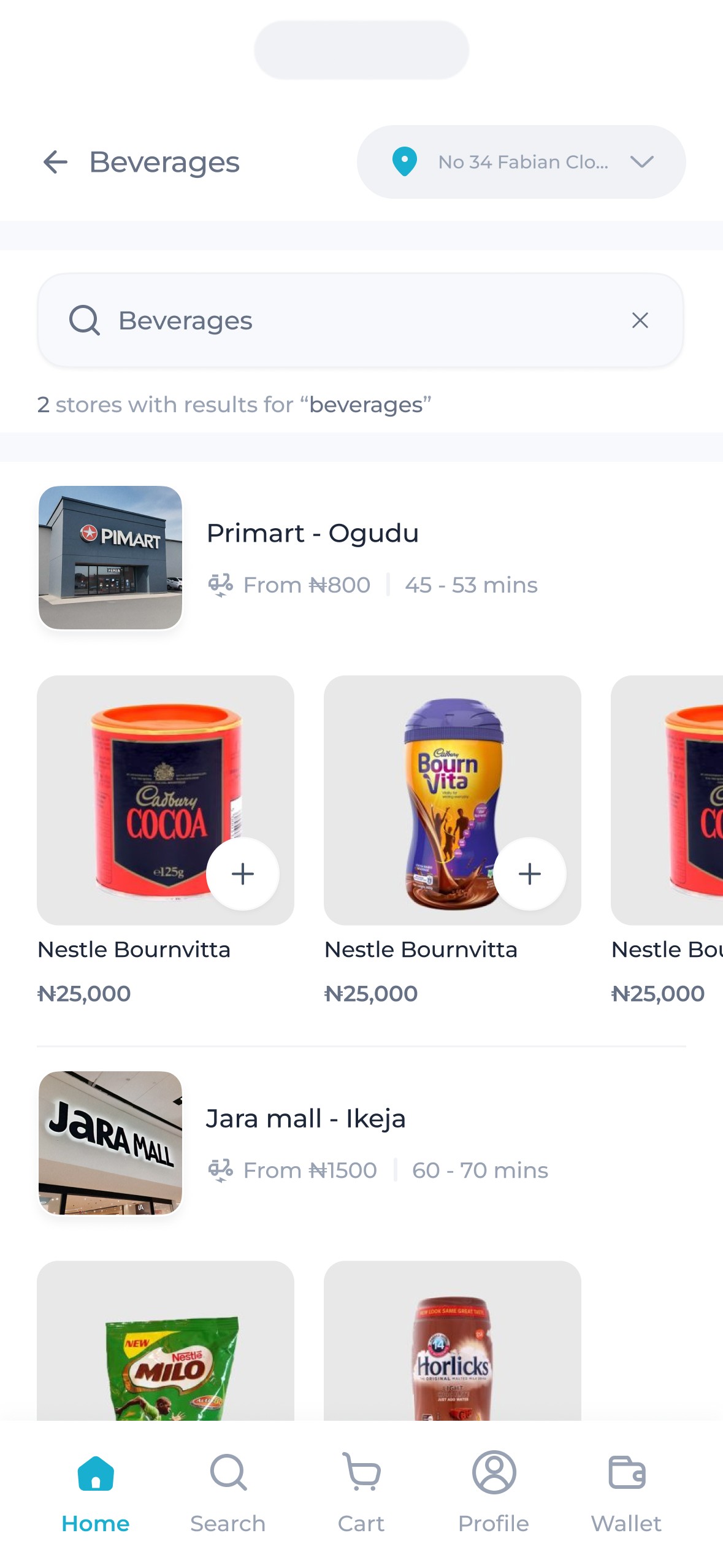
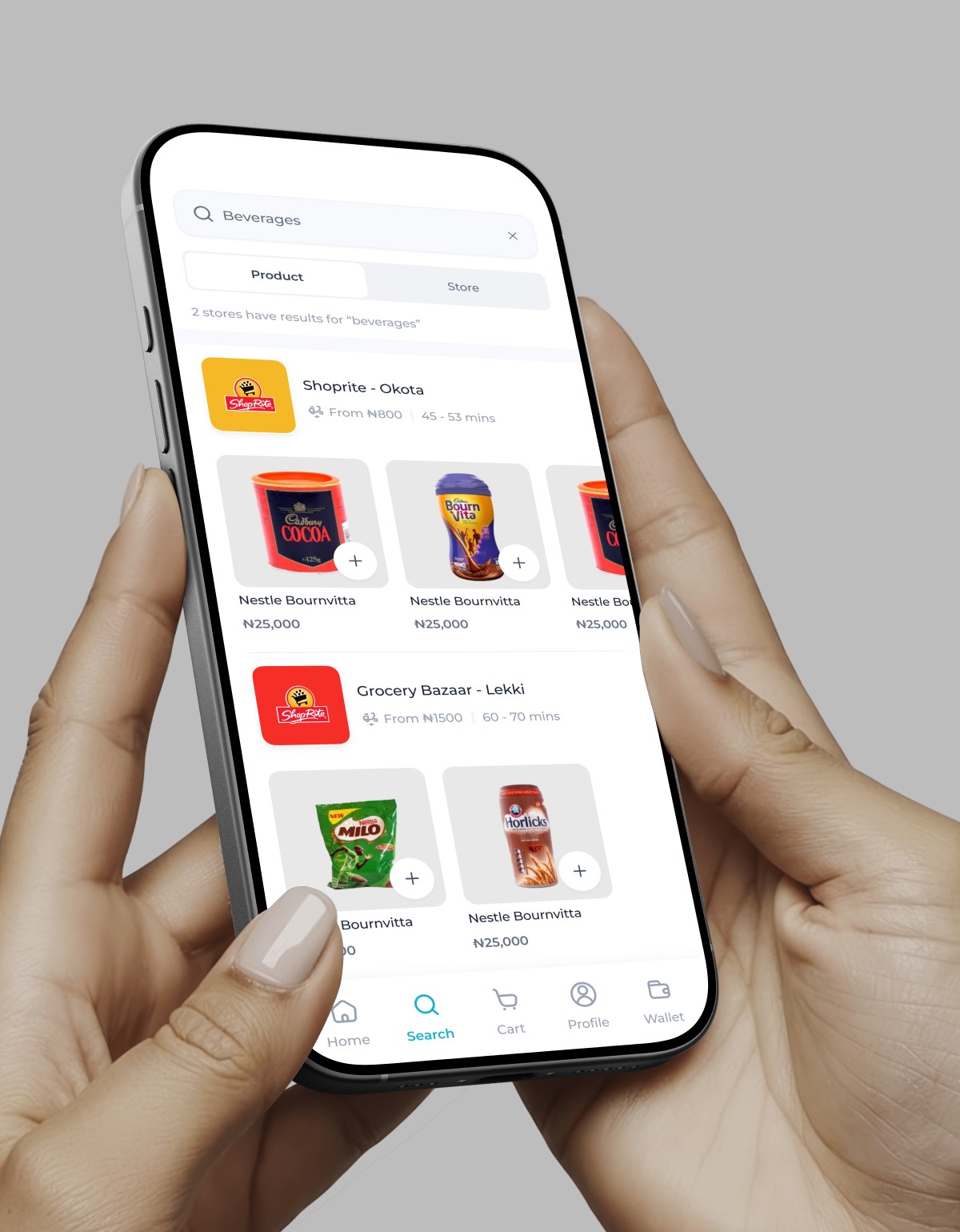
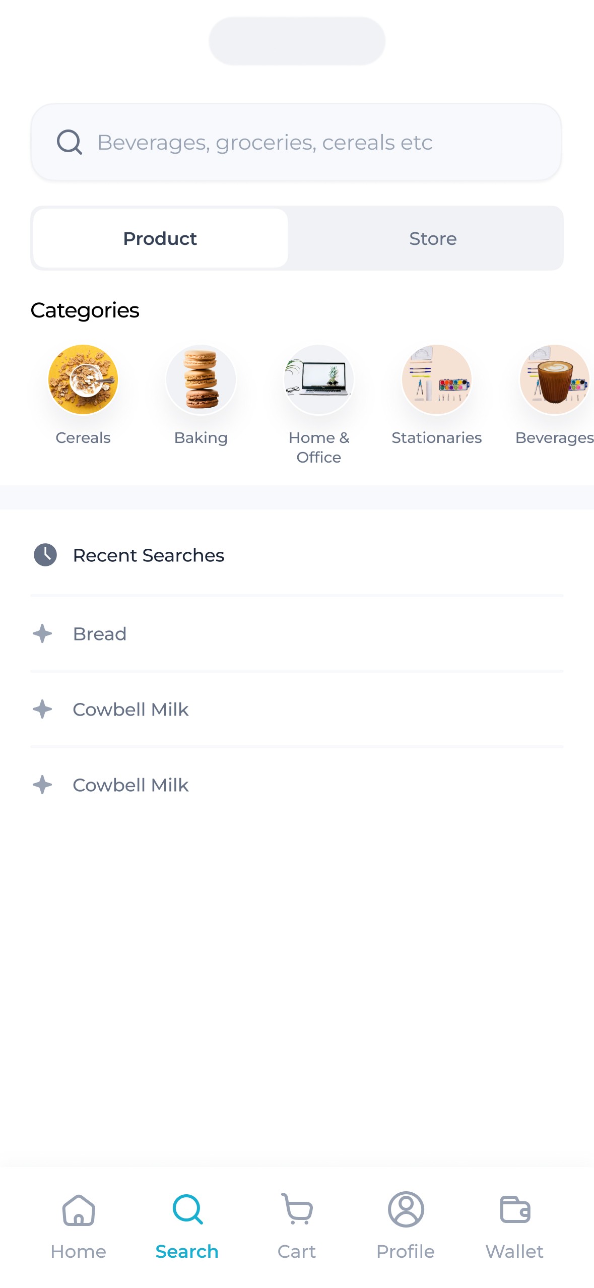
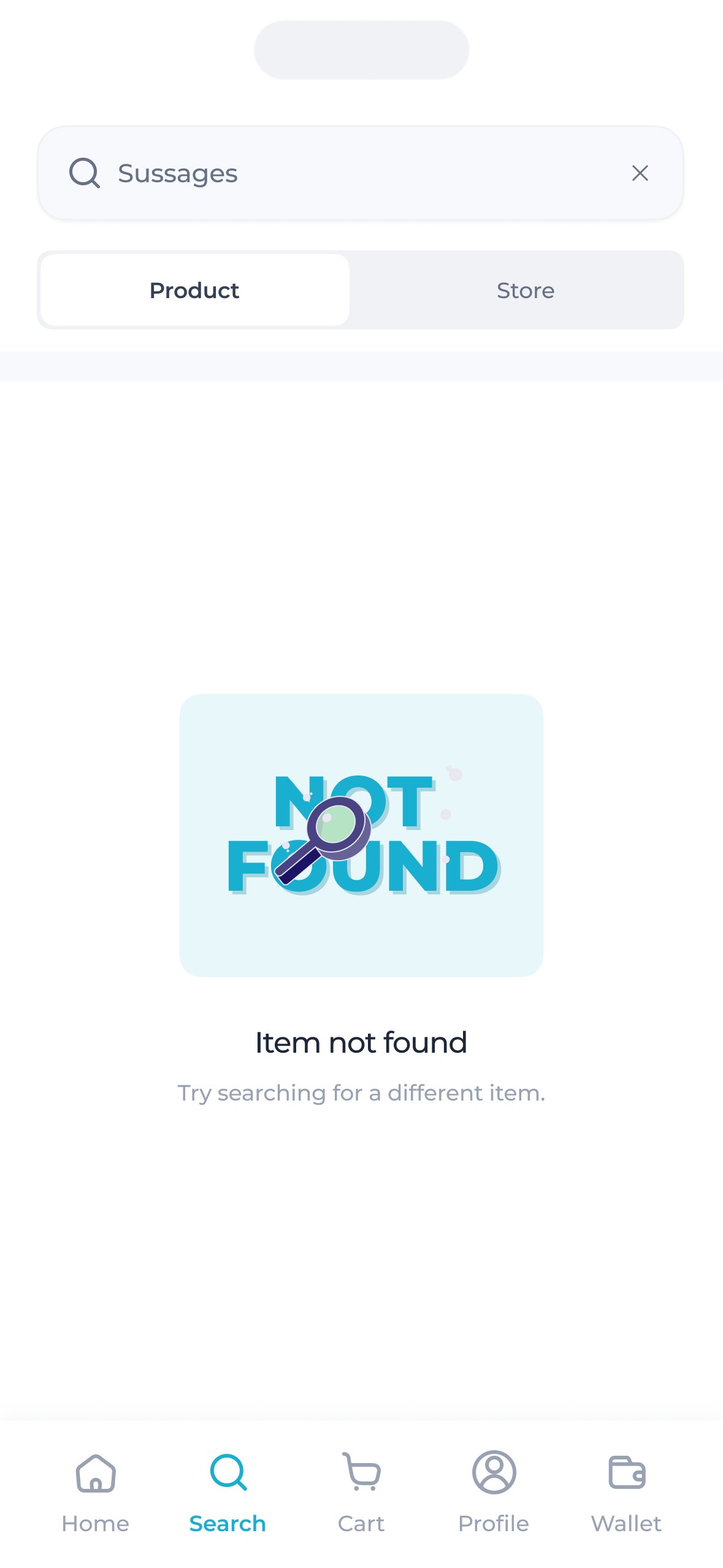
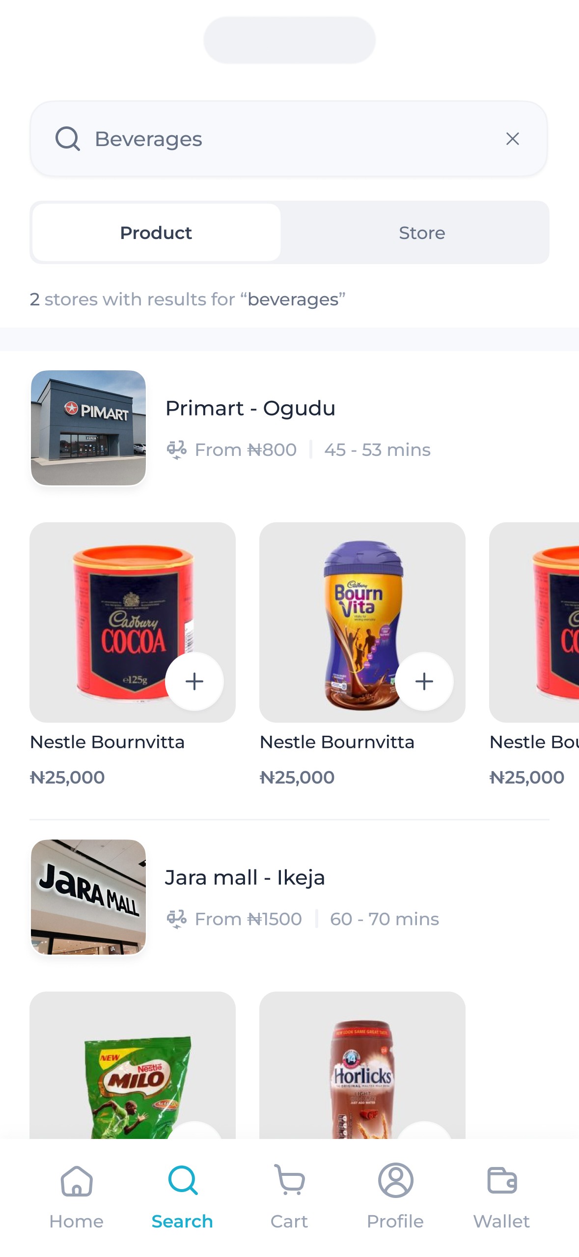
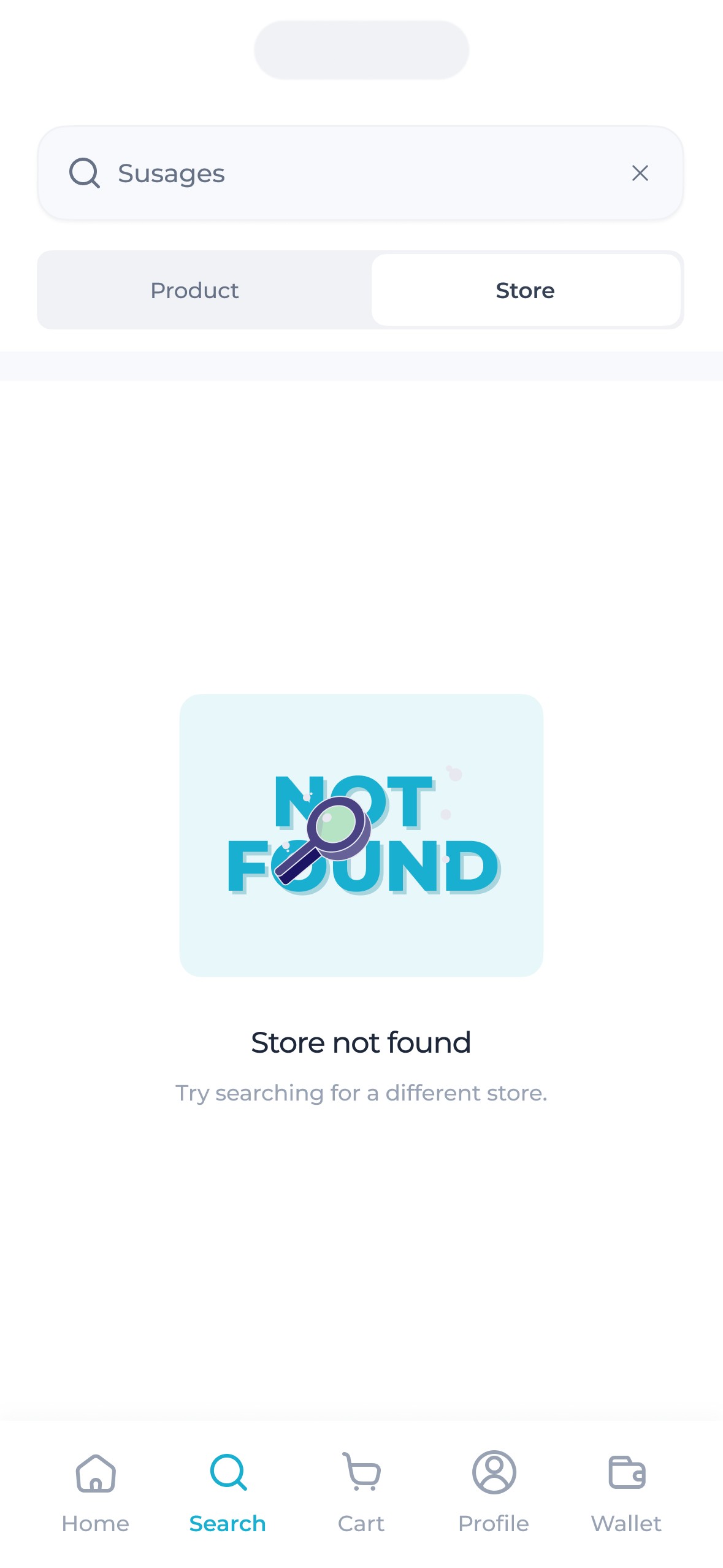
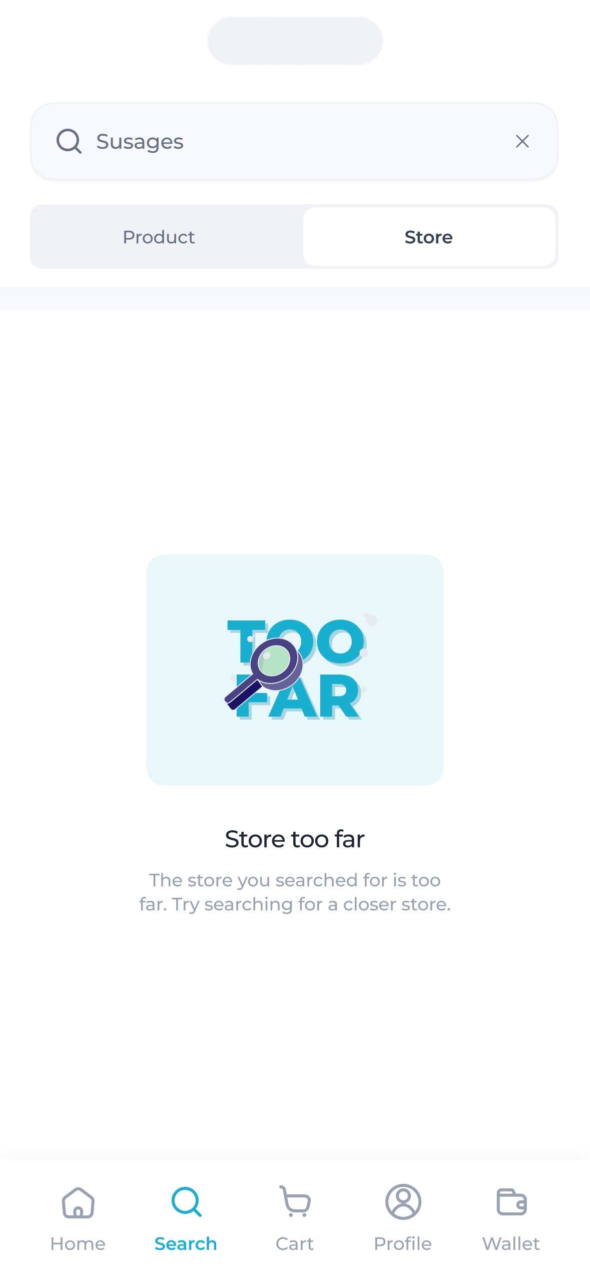
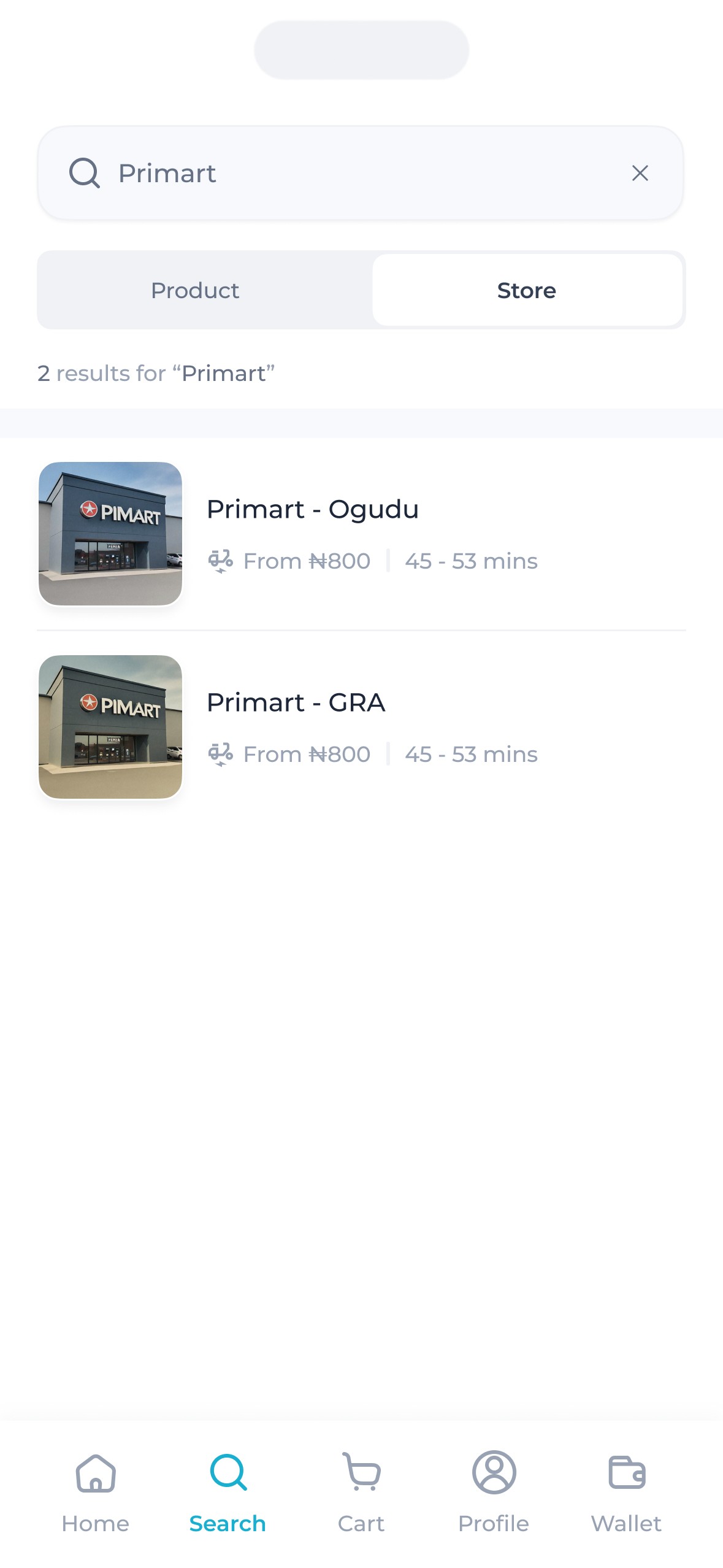
The search.
Zippi's search feature was designed with a few key constraints in mind. To ensure efficient logistics and operational management, buyers could only place orders from one supermarket at a time. Additionally, they needed the ability to search either for supermarkets to order from or for individual products.
The interface had to reflect all this.
We wanted buyers to have a flexible search experience without overwhelming them with complexity. To strike that balance, a filter tab was introduced—allowing users to easily search for specific products or stores within their vicinity.
To make the search experience more intuitive, results (for product searches) were grouped by store. This not only helped buyers see exactly where each product was coming from but also made it easy to tell if the item matched the store of their current cart.
Another key consideration was distance. Buyers could sometimes search for stores that were too far from their location, which could affect delivery times. To solve this, we introduced a distance limit that ensured orders were only placed within a manageable range—keeping operations smooth and deliveries prompt.
We also introduced a subtle but useful detail—the “number of stores” indicator. Whenever buyers searched for a product, they could immediately see how many nearby stores had that item in stock, helping them make quicker, more informed choices.
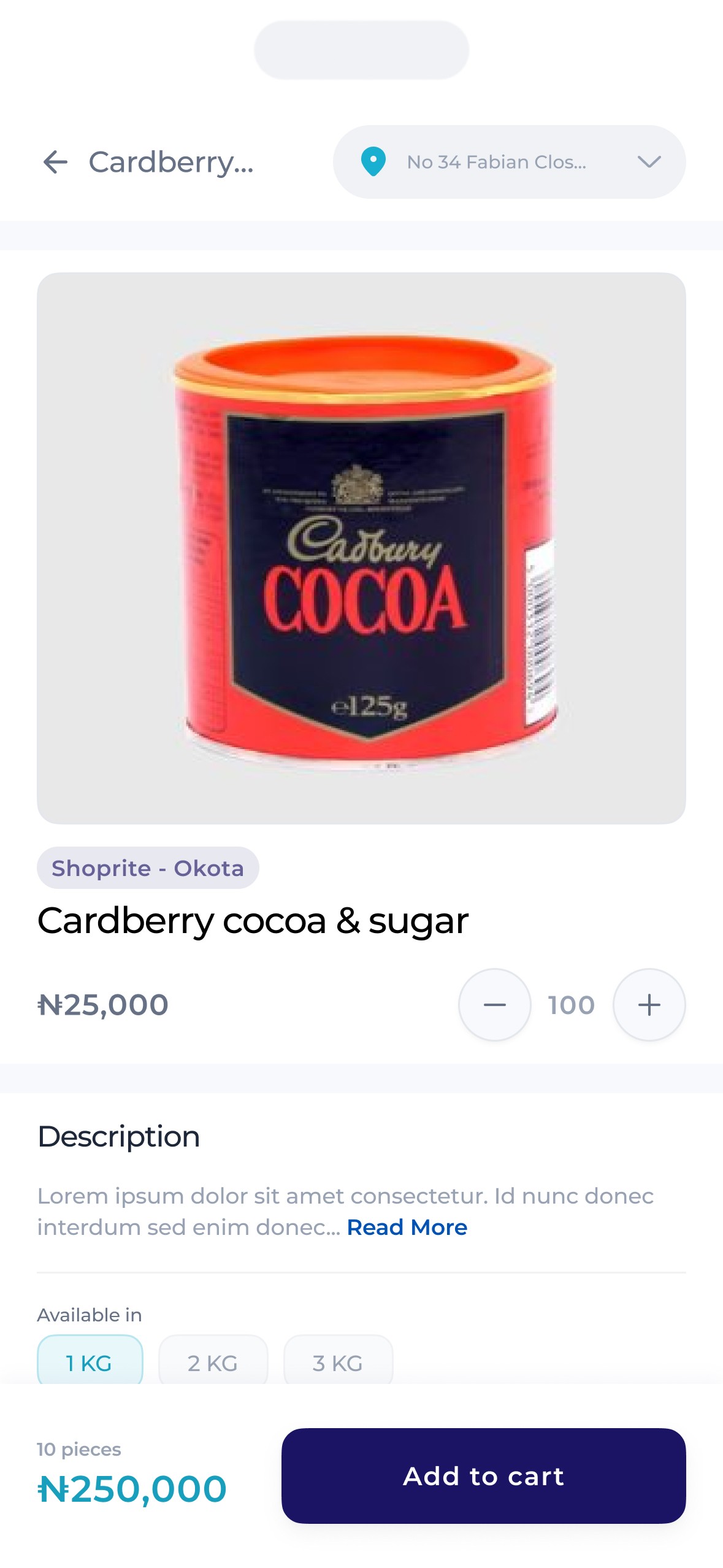
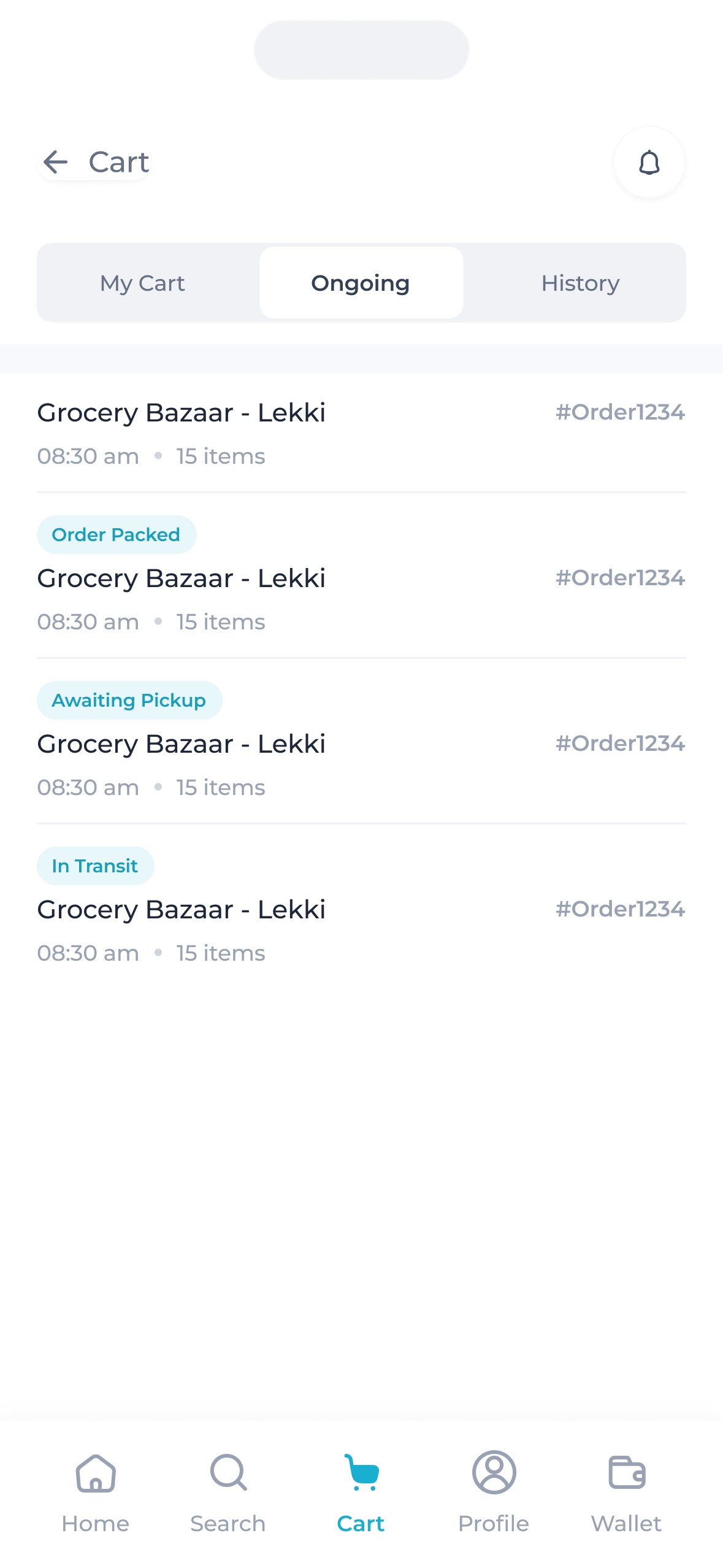
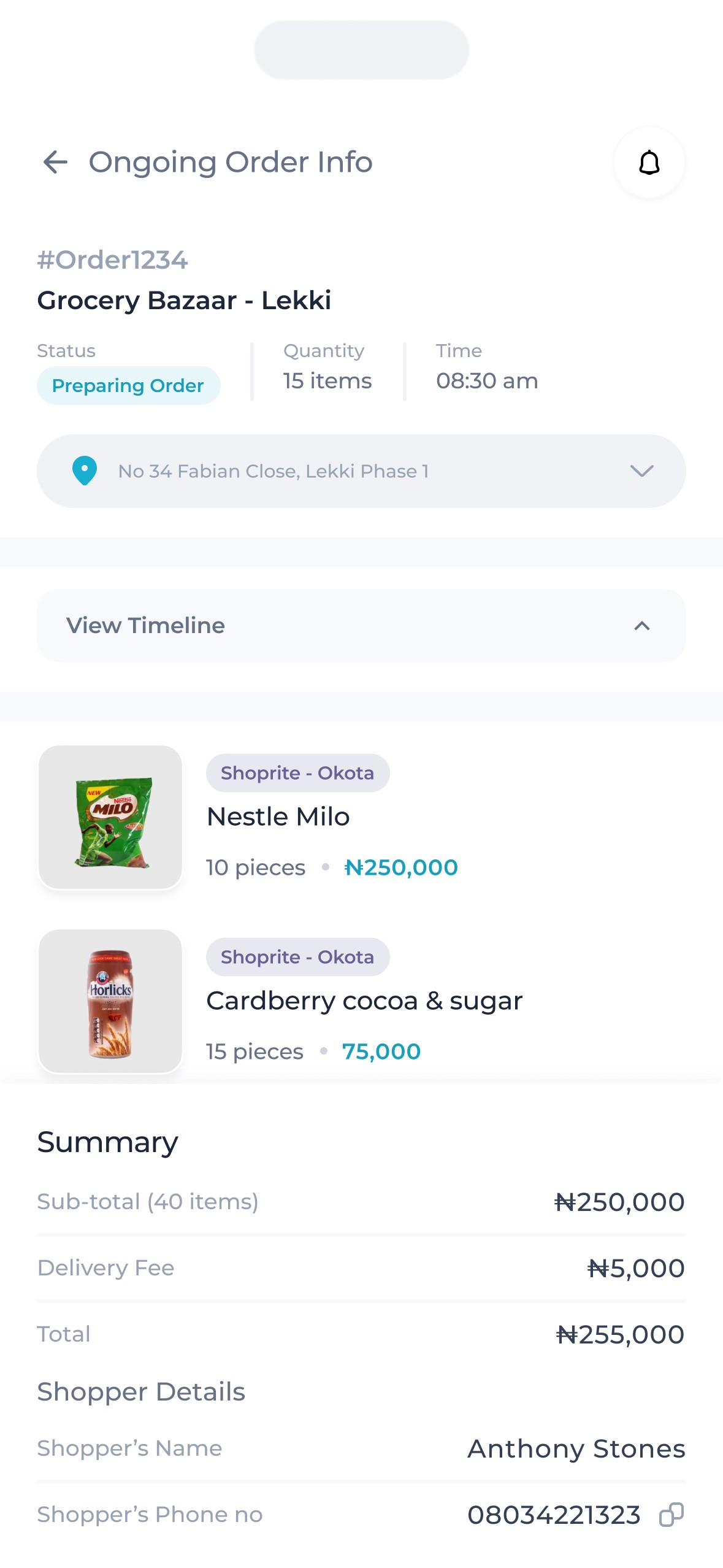
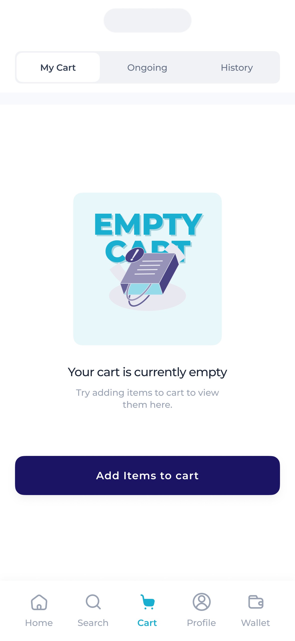
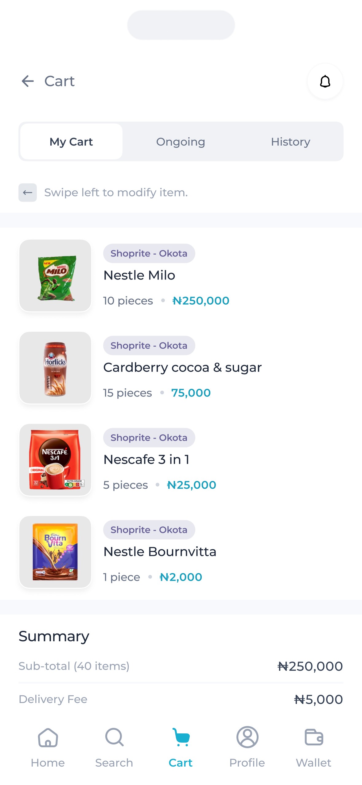
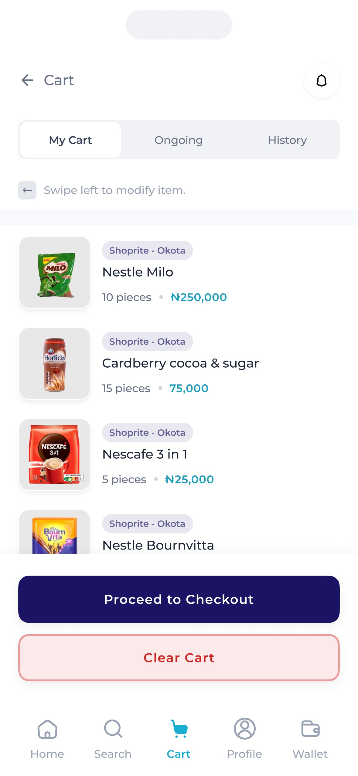
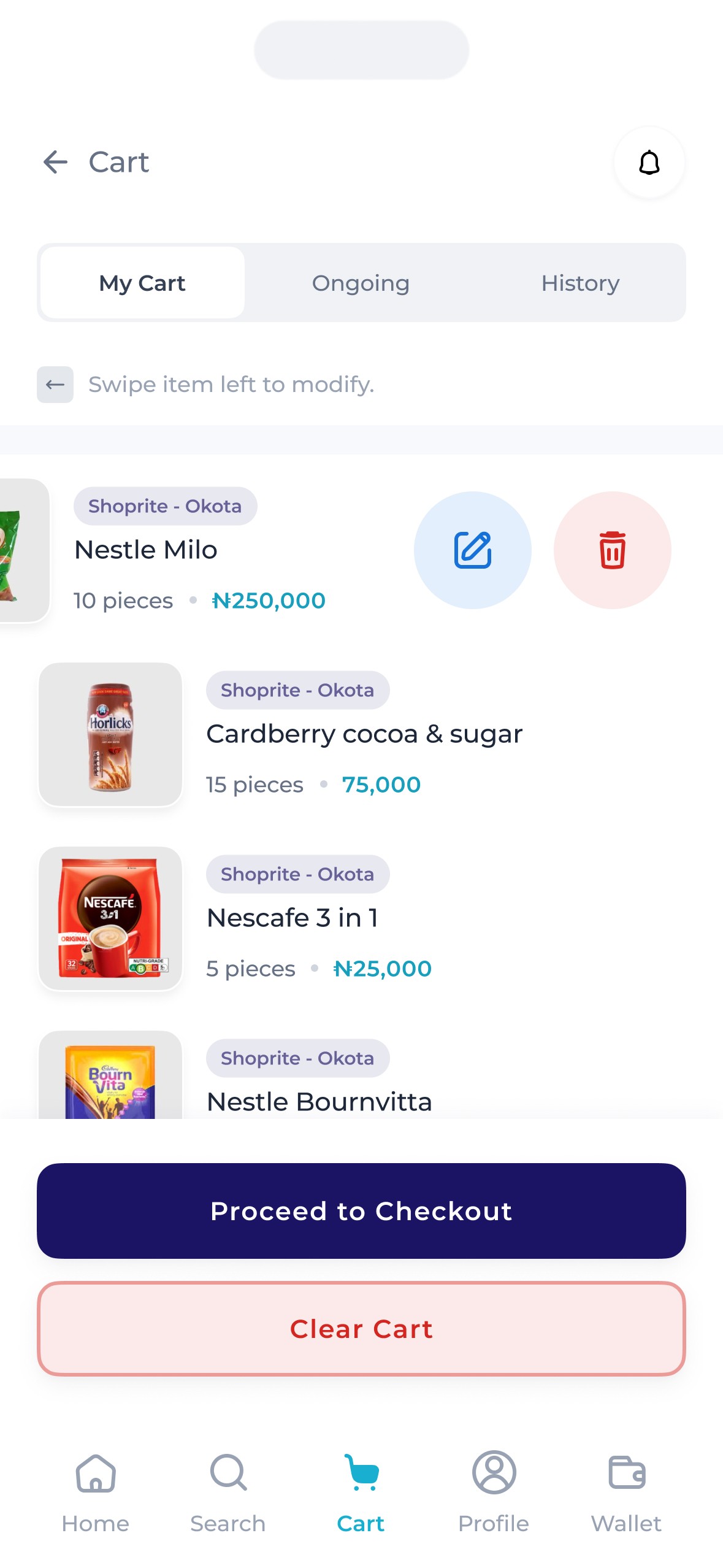
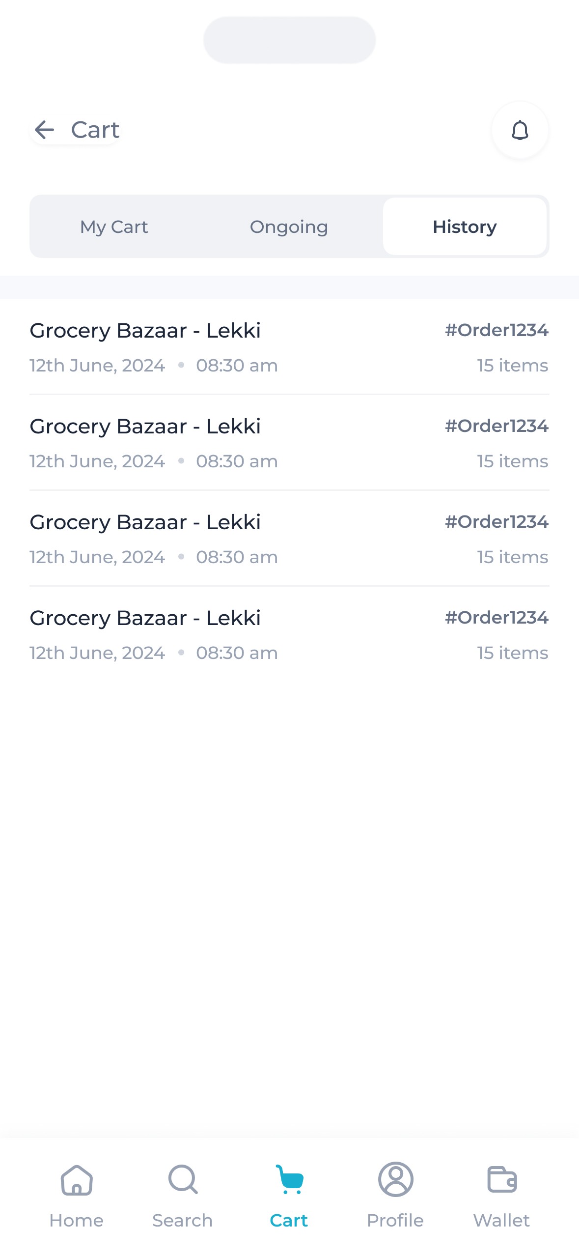
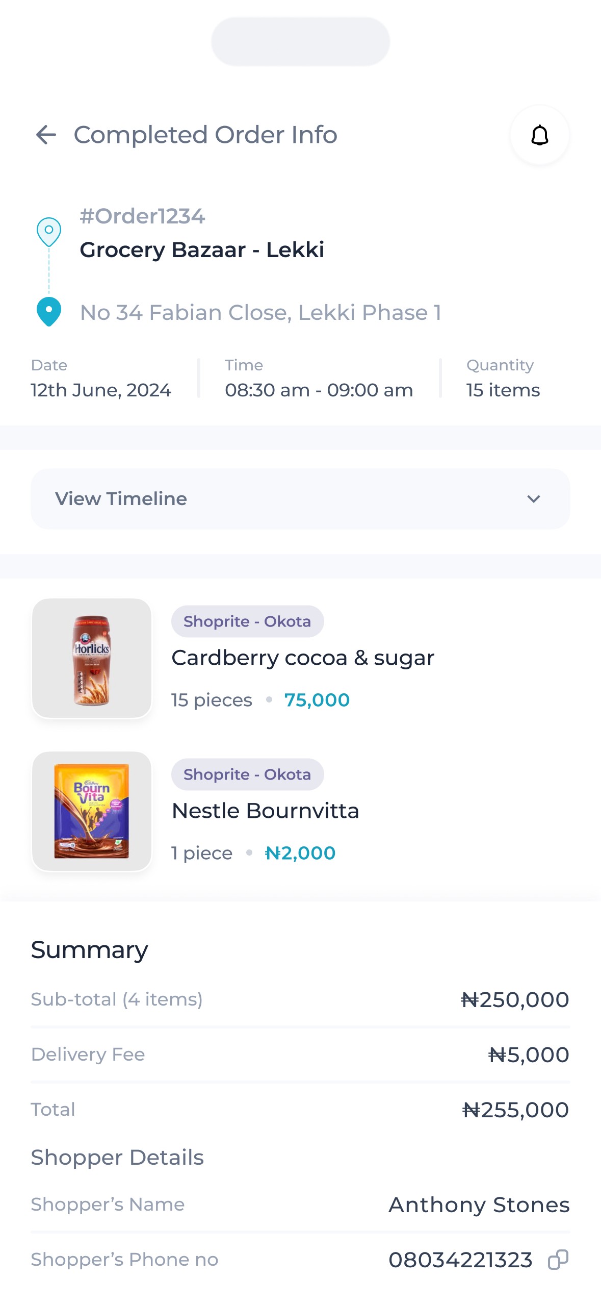
Carts.
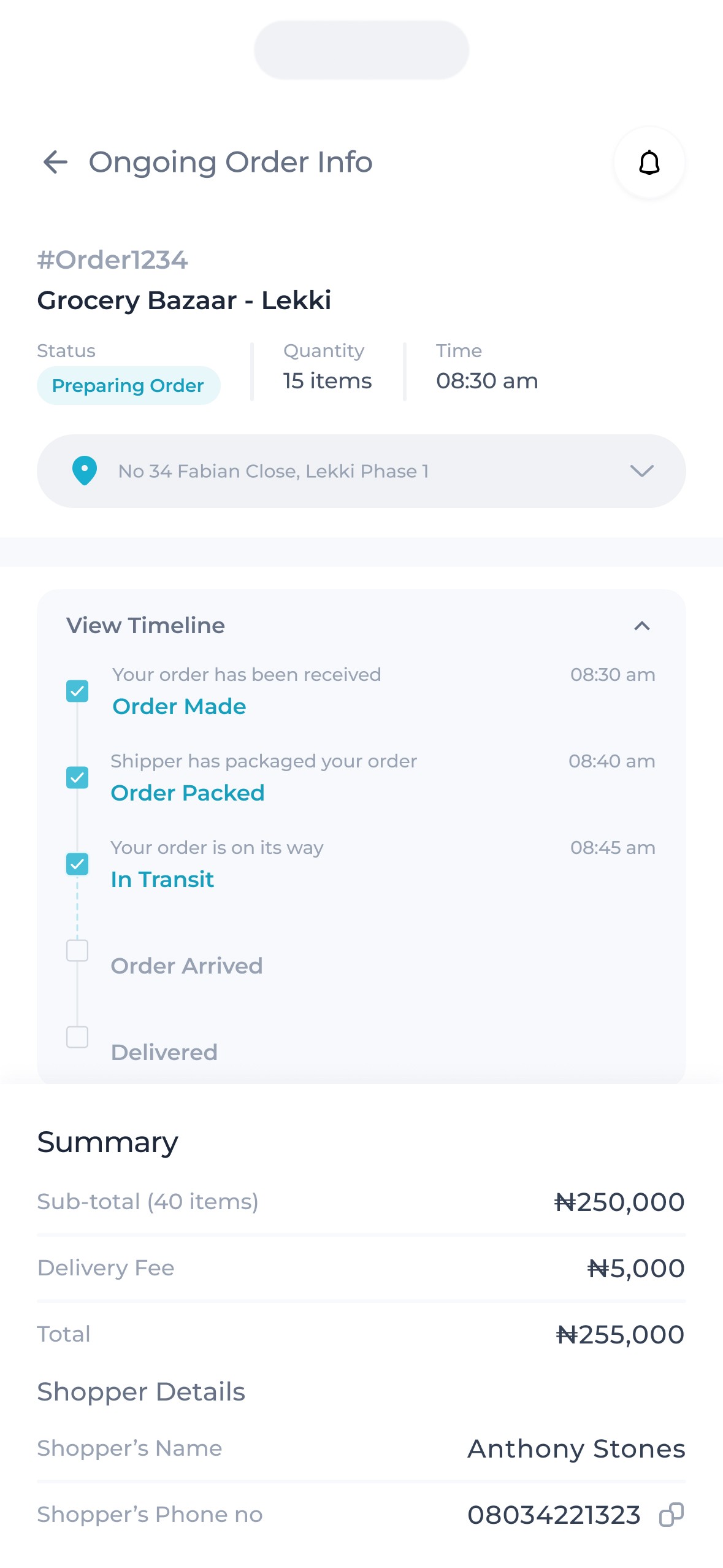
While the ‘constraint’ on buyers placing orders from one supermarket at a time was important, it was also vital to account for the cases where a single supermarket doesn’t have all that a buyer needs. To do this, we went with a sequential flow rather than a concurrent one by introducing a queue dubbed the ‘ongoing orders’.
This was distinct from the cart where the buyer can add items they're about to purchase. It consisted of orders placed by the buyer that's in the process of delivery. So, it allowed buyers to place new orders regardless of the delivery status of the previous one, meaning buyers could place orders from multiple stores sequentially.
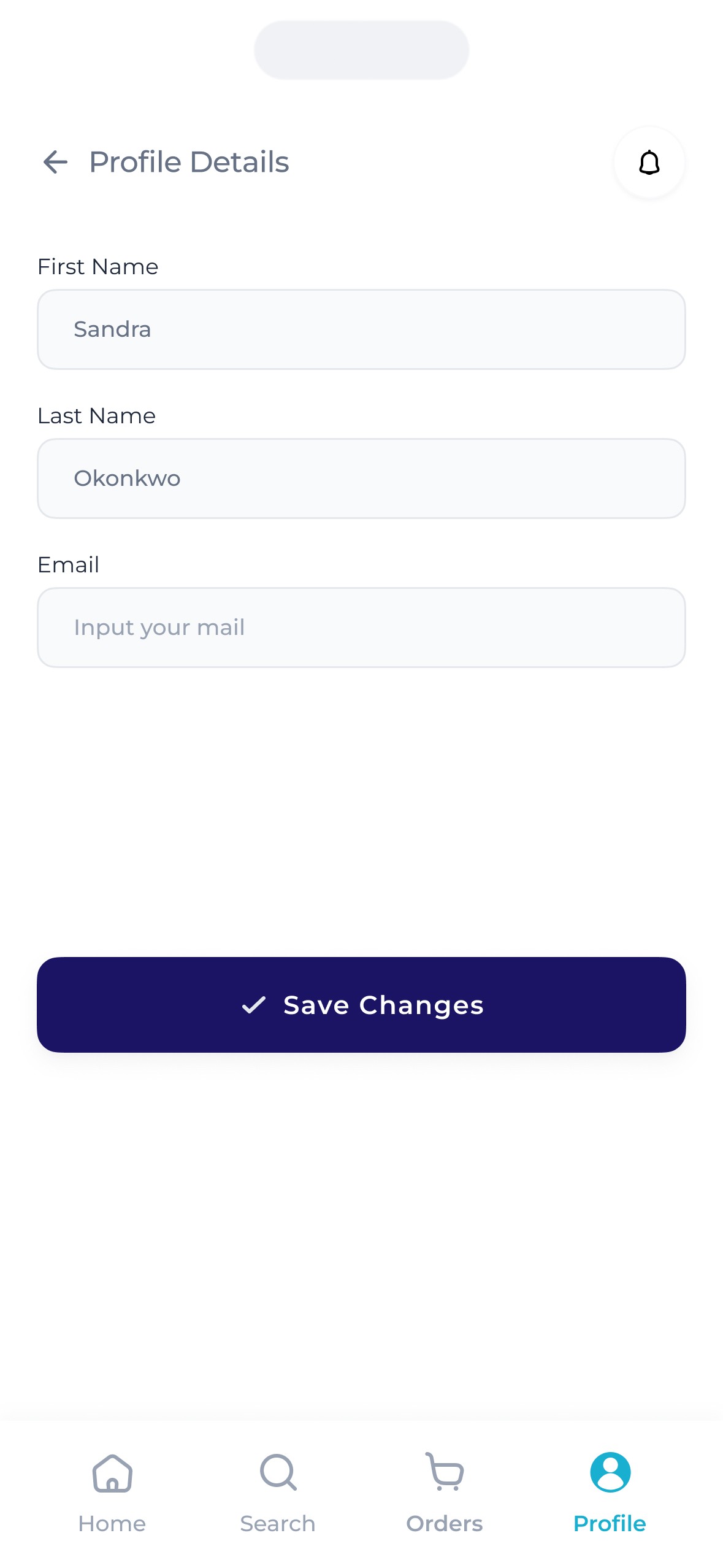
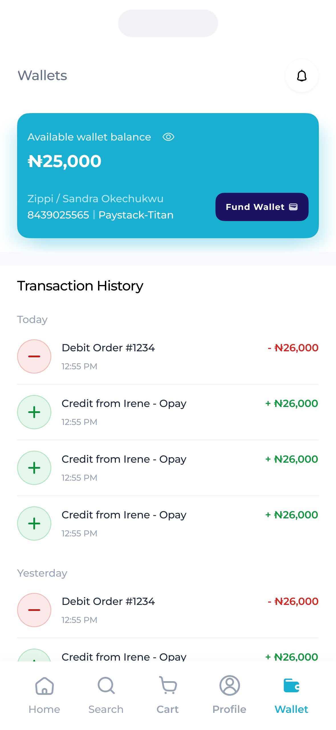
Others
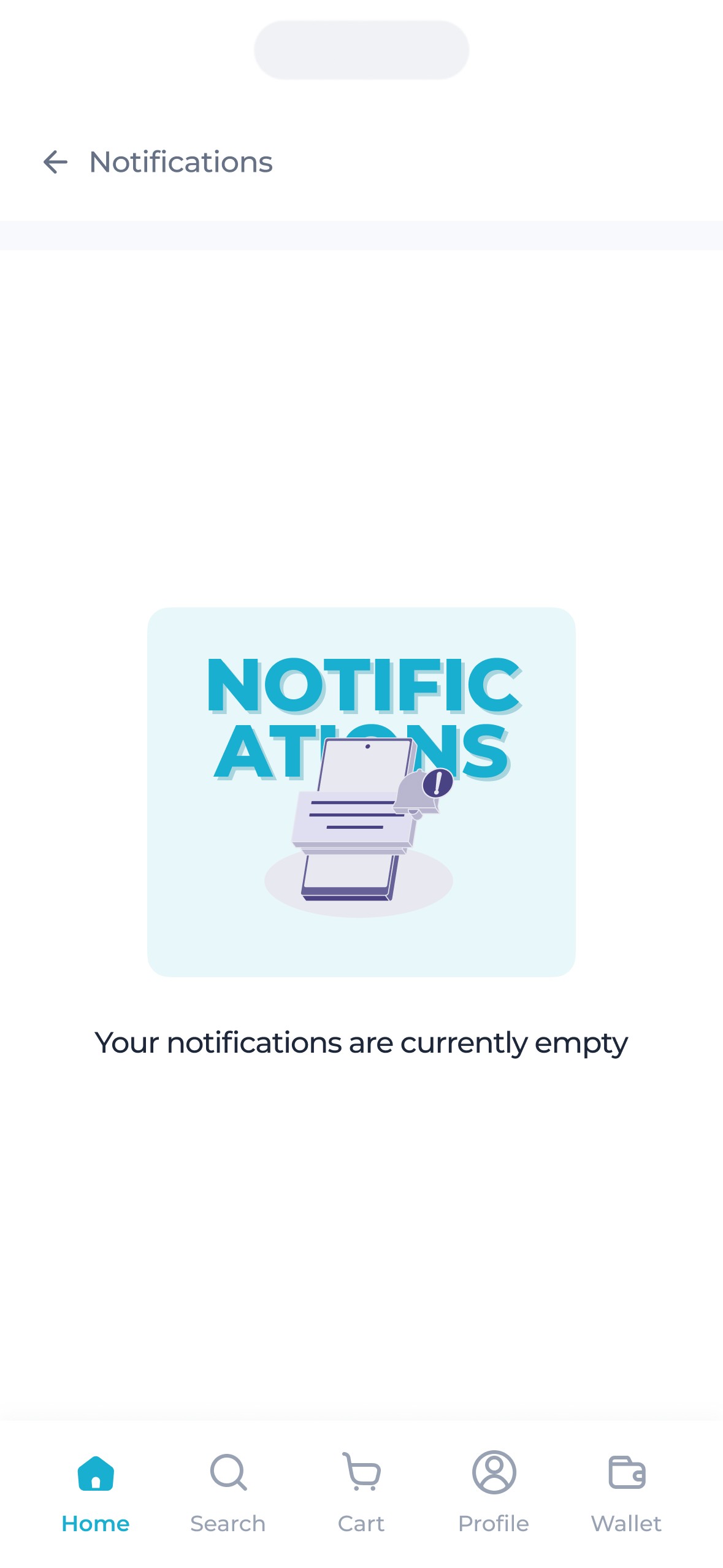
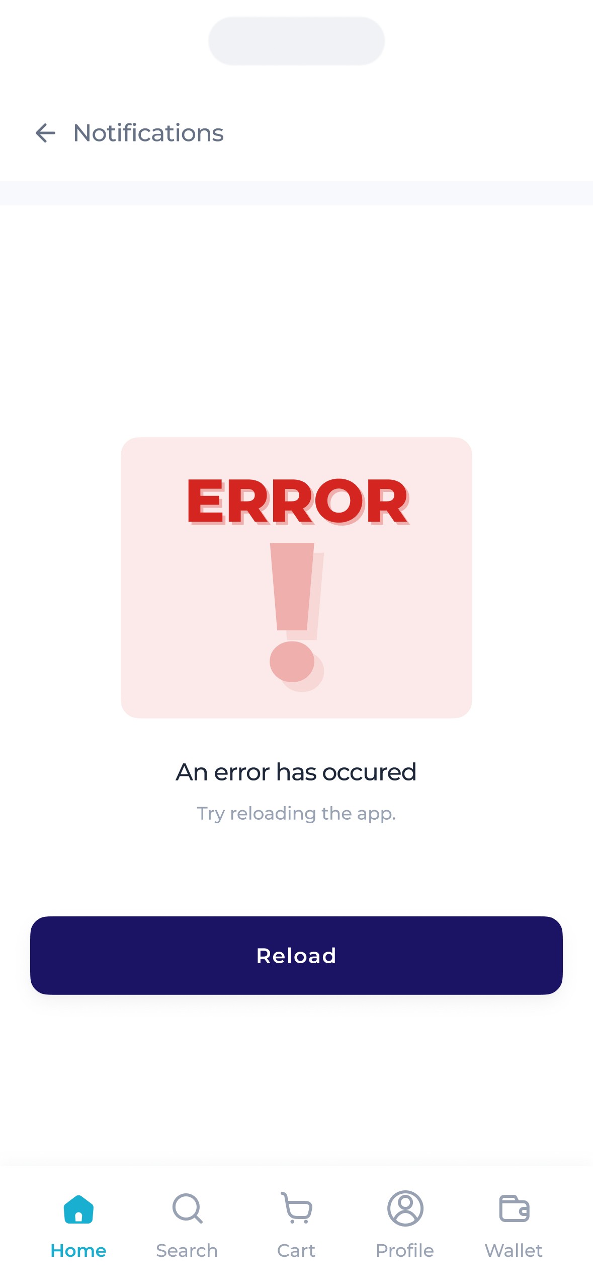
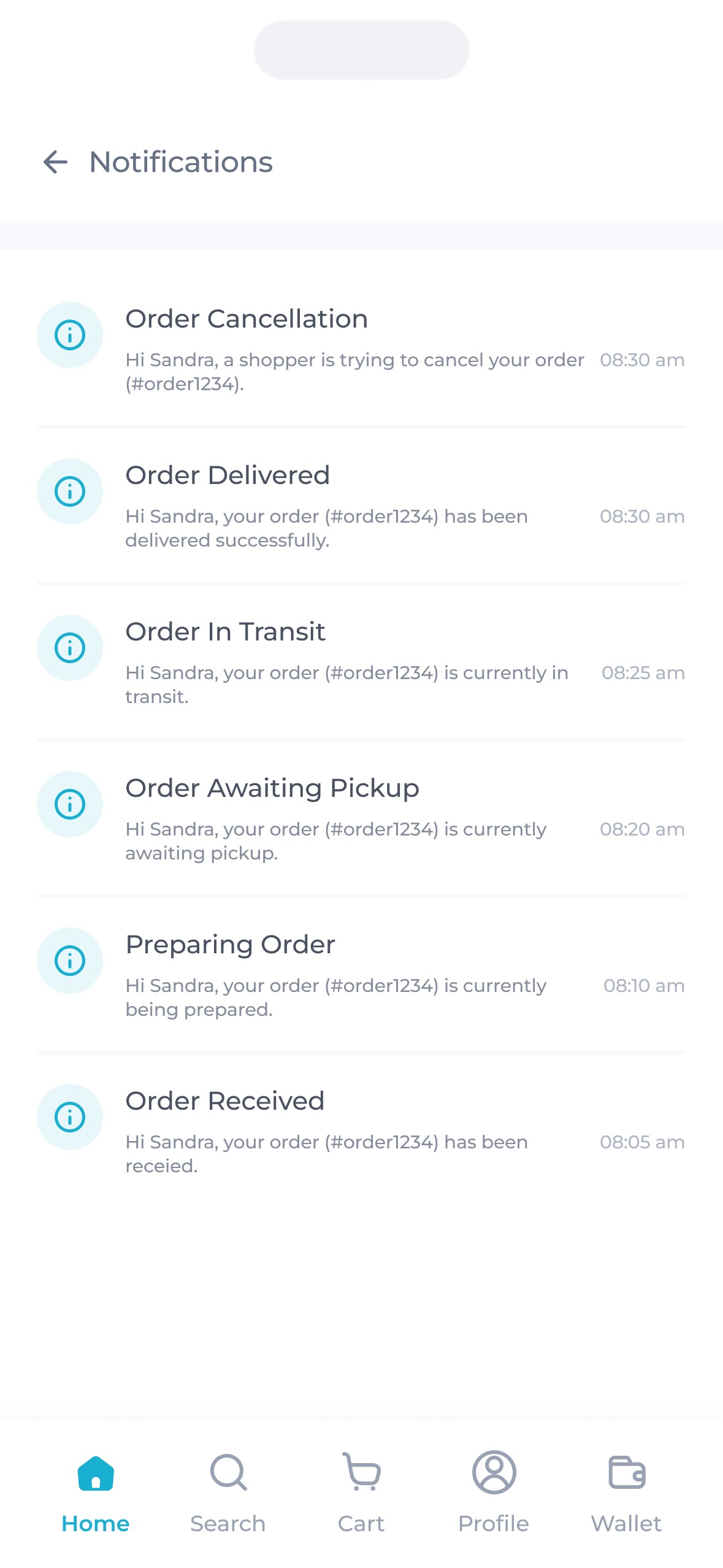
Here are some other screens that made it into production.
The Shopper.
This is the secondary user – he/she who is physically available at the supermarket / store to pick out & package orders then send them to the buyer through the rider – for a fee.
The idea for shoppers was simple – Zippi shoppers would be able to walk into any Zippi affiliated supermarket/store then receive orders sent by buyers to that store, which they'd then pack & hand over to a rider, after which they'd receive payments for their efforts. The shopper was one of two secondary users.
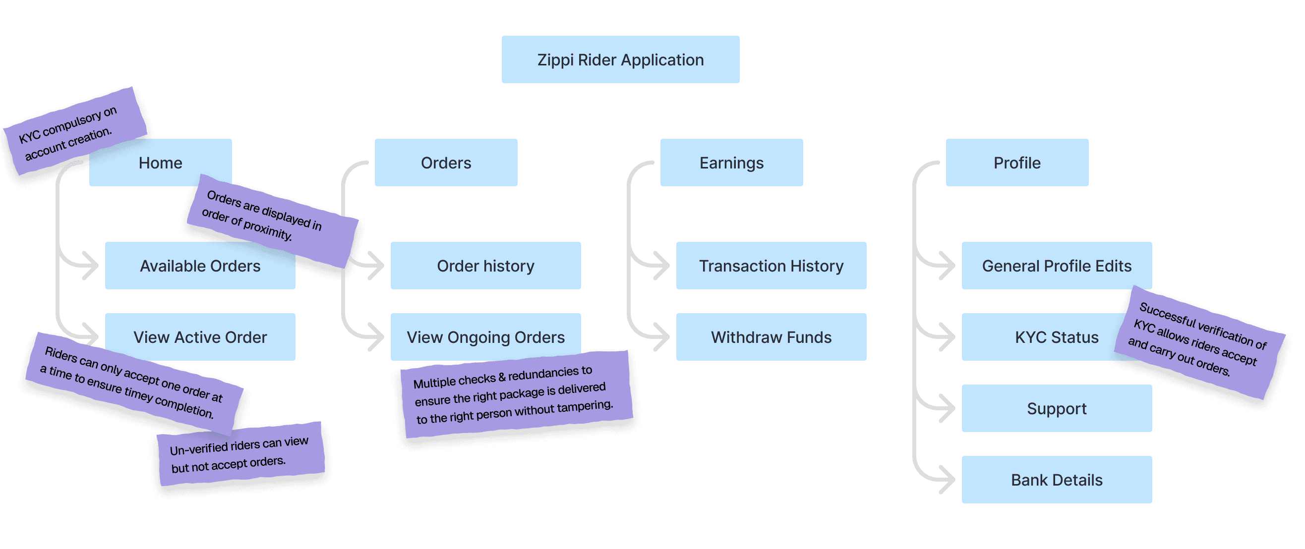
For these users, somethings were clear
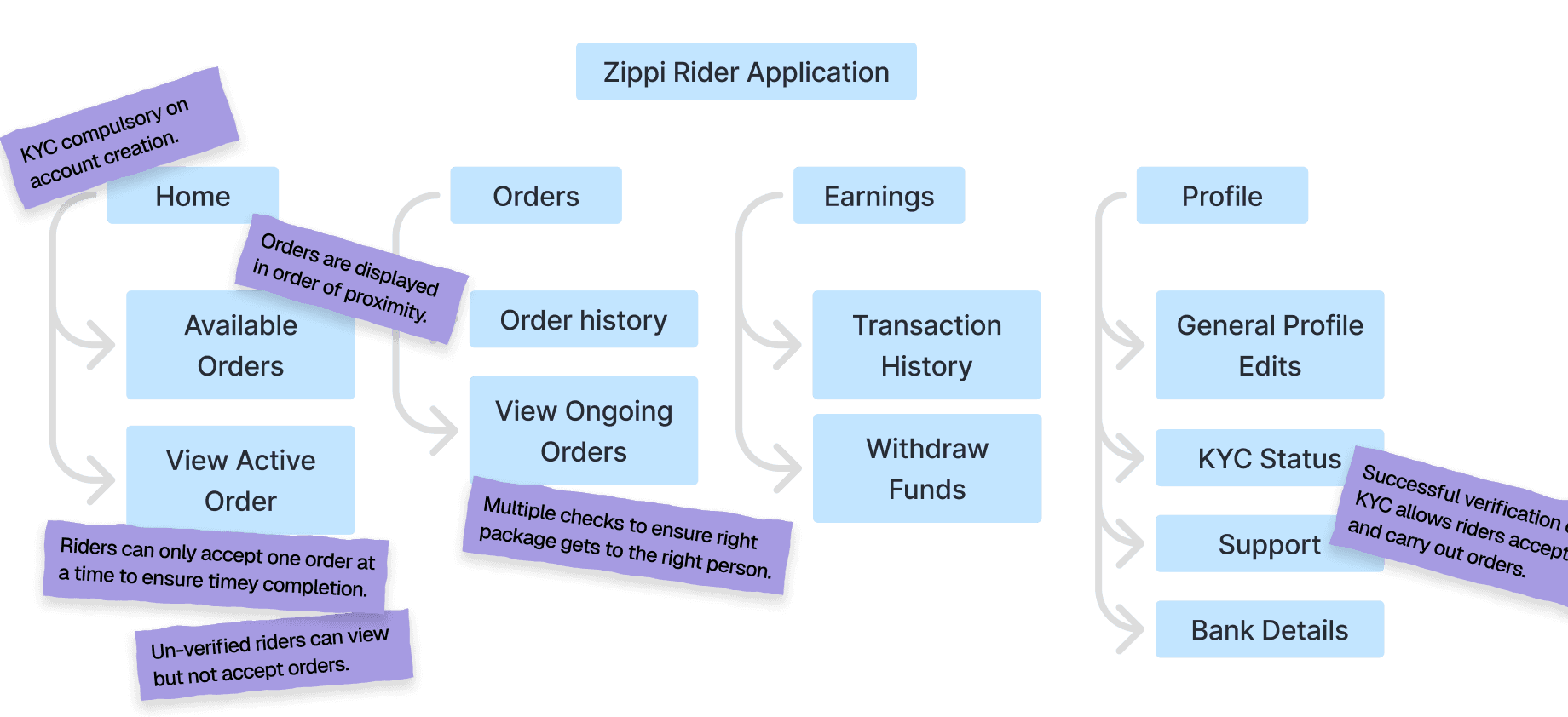
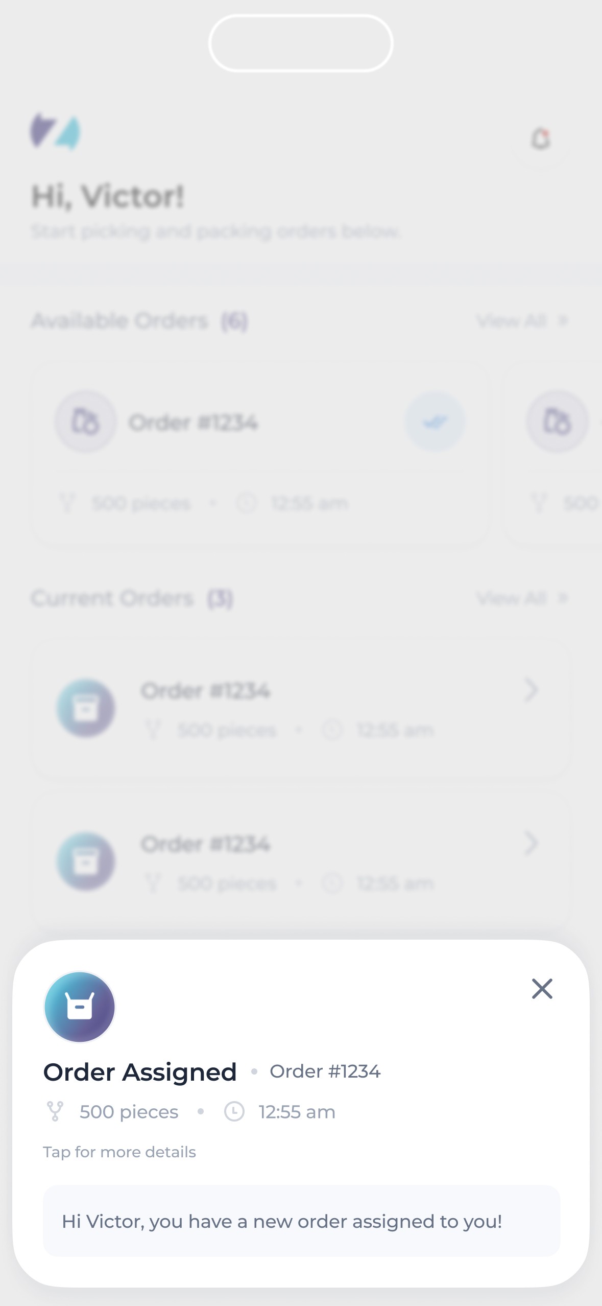
They needed to be able to walk into any Zippi affiliated store then receive buyer orders.
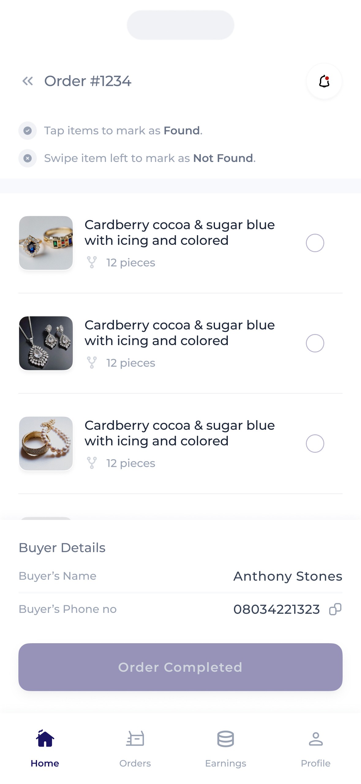
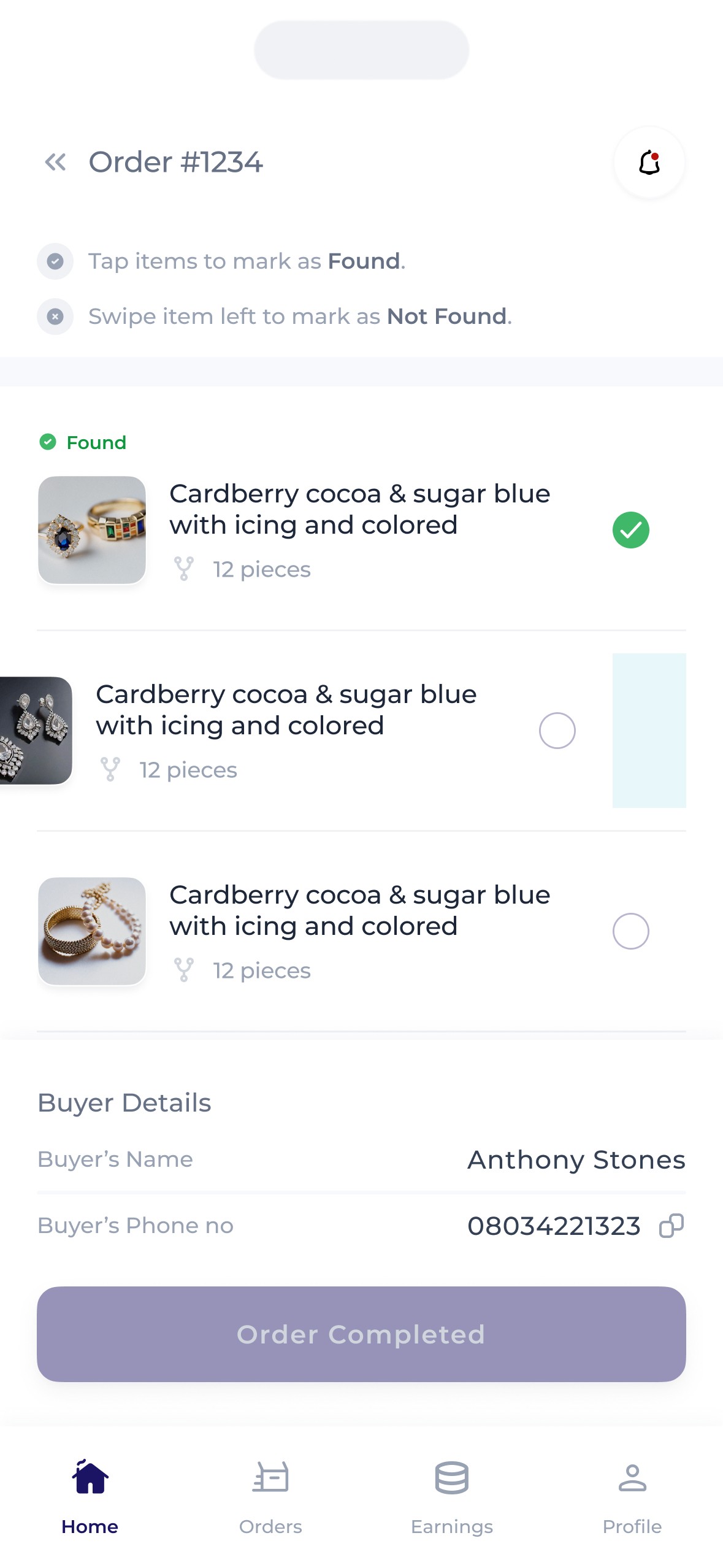
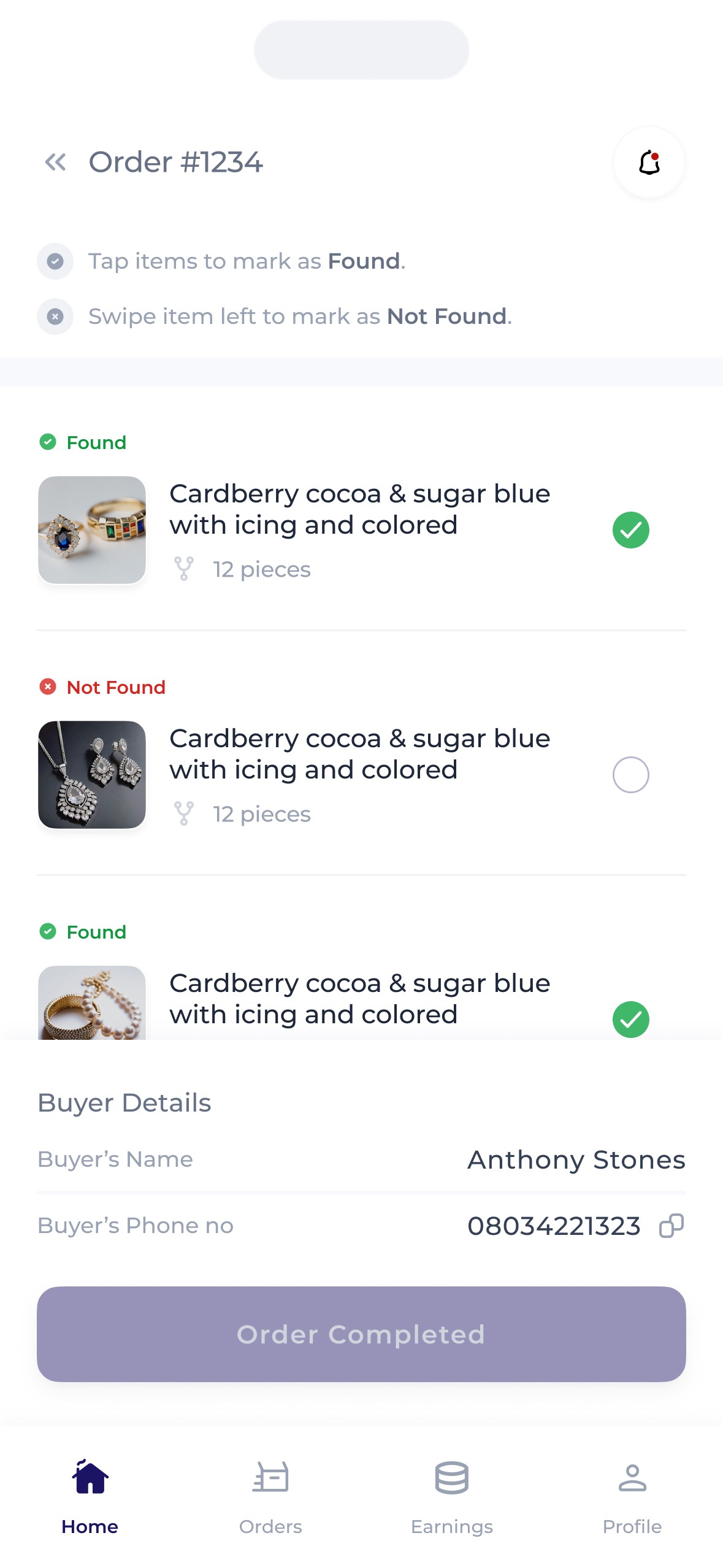
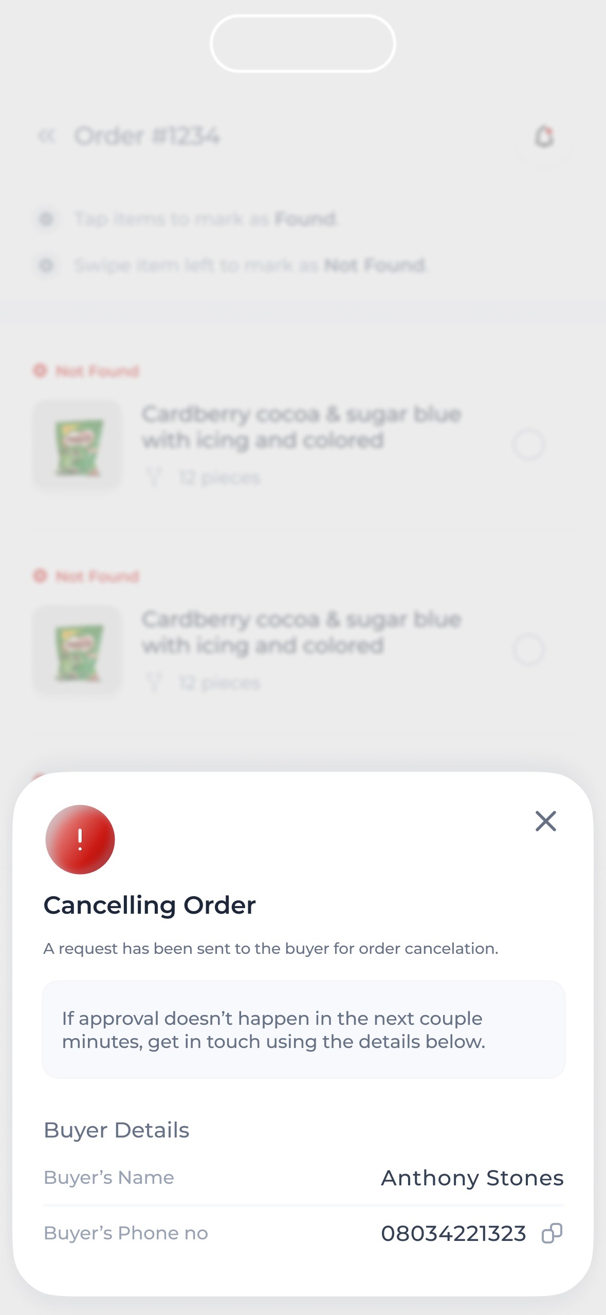
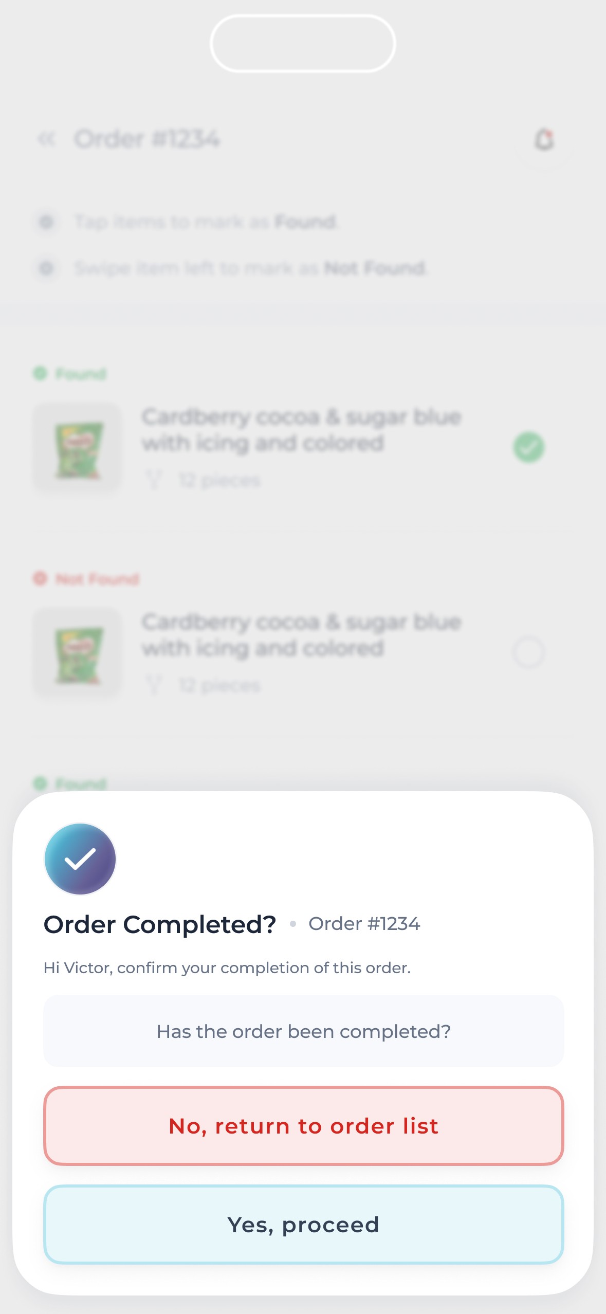
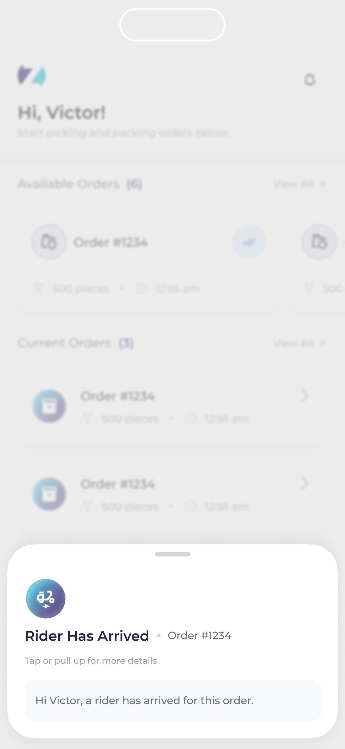
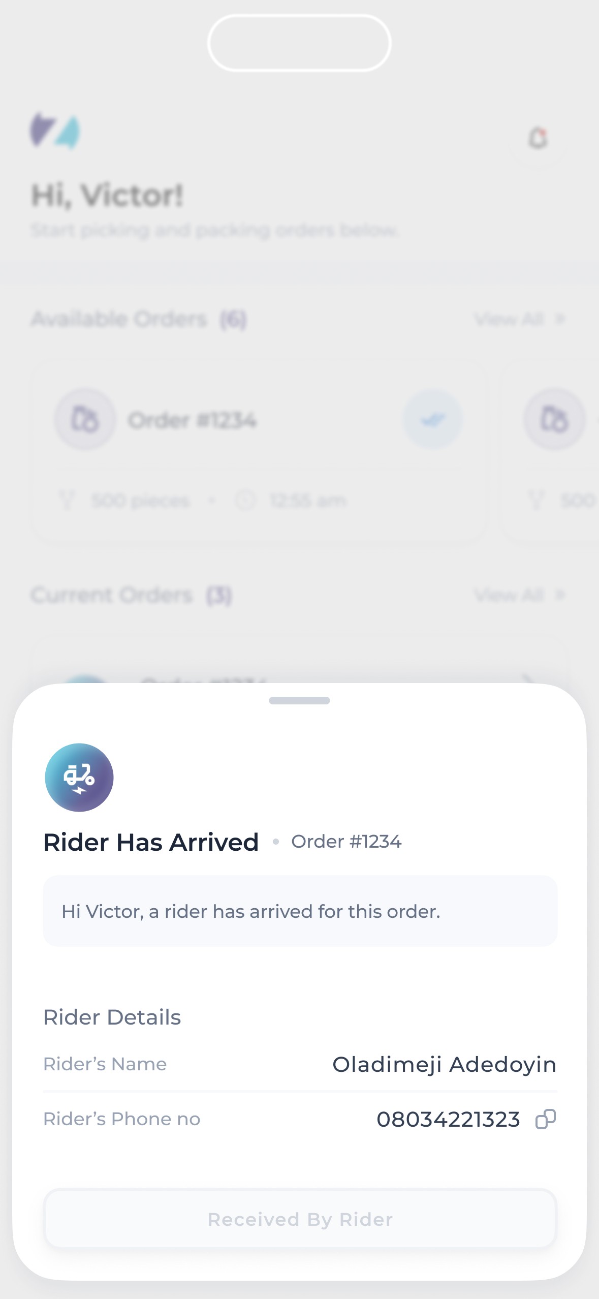
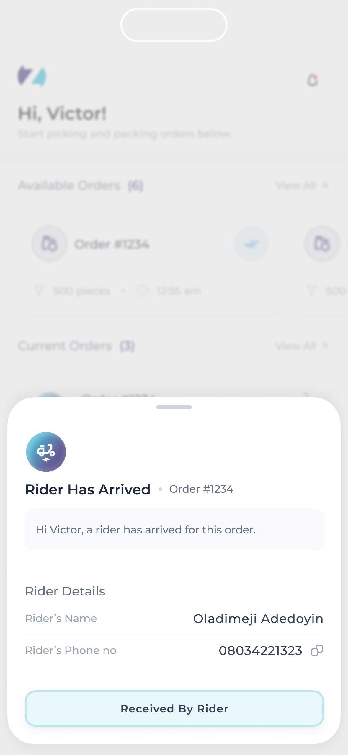
They needed to be able to view orders, view the details of each order, pack them, then send them for delivery.
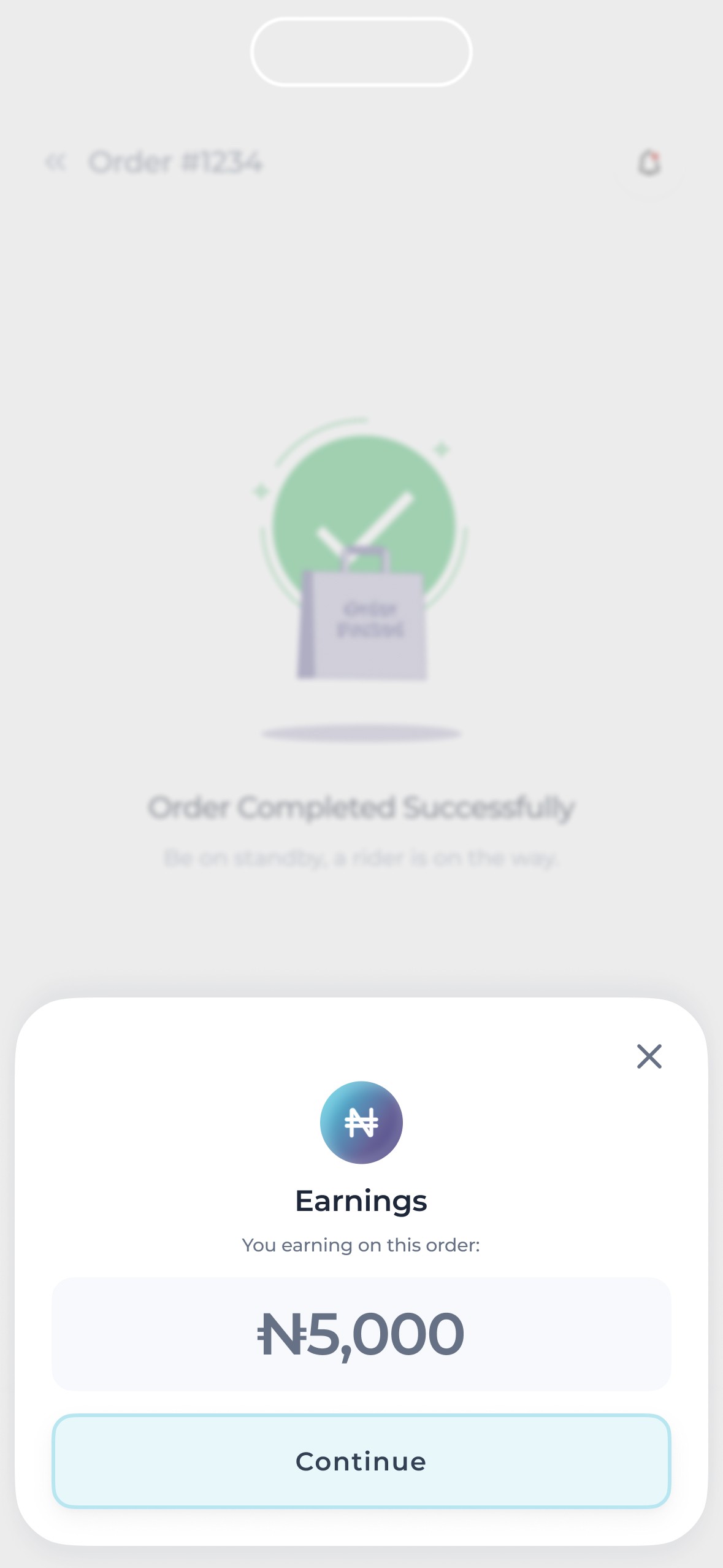
They needed to be able to make & withdraw their earnings.
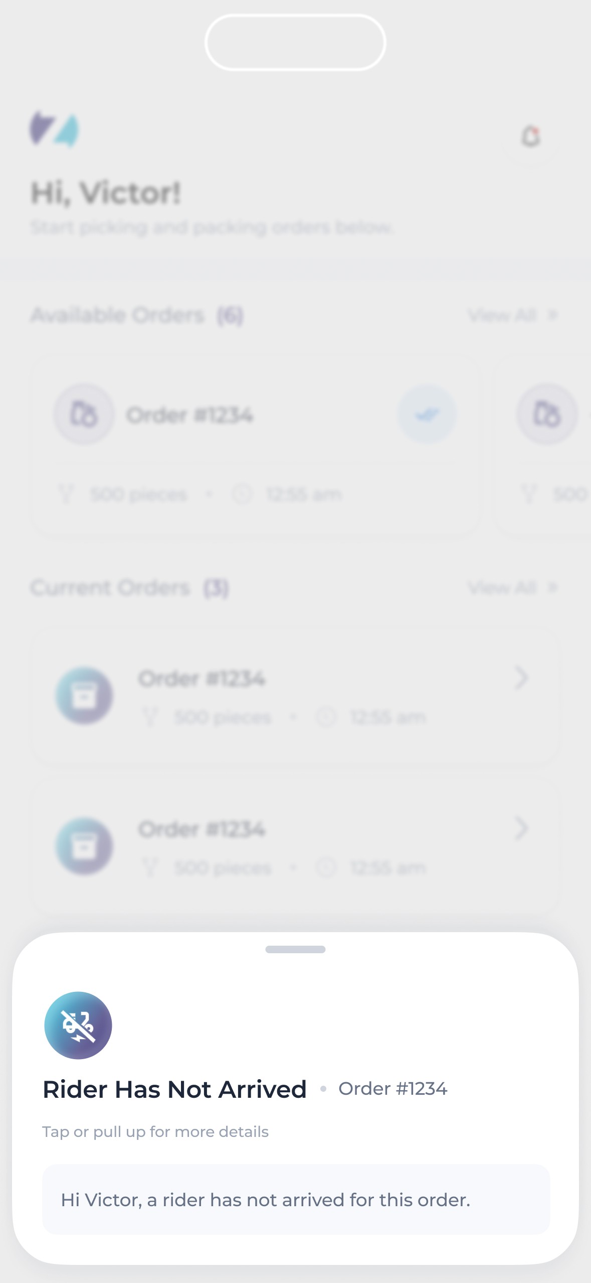
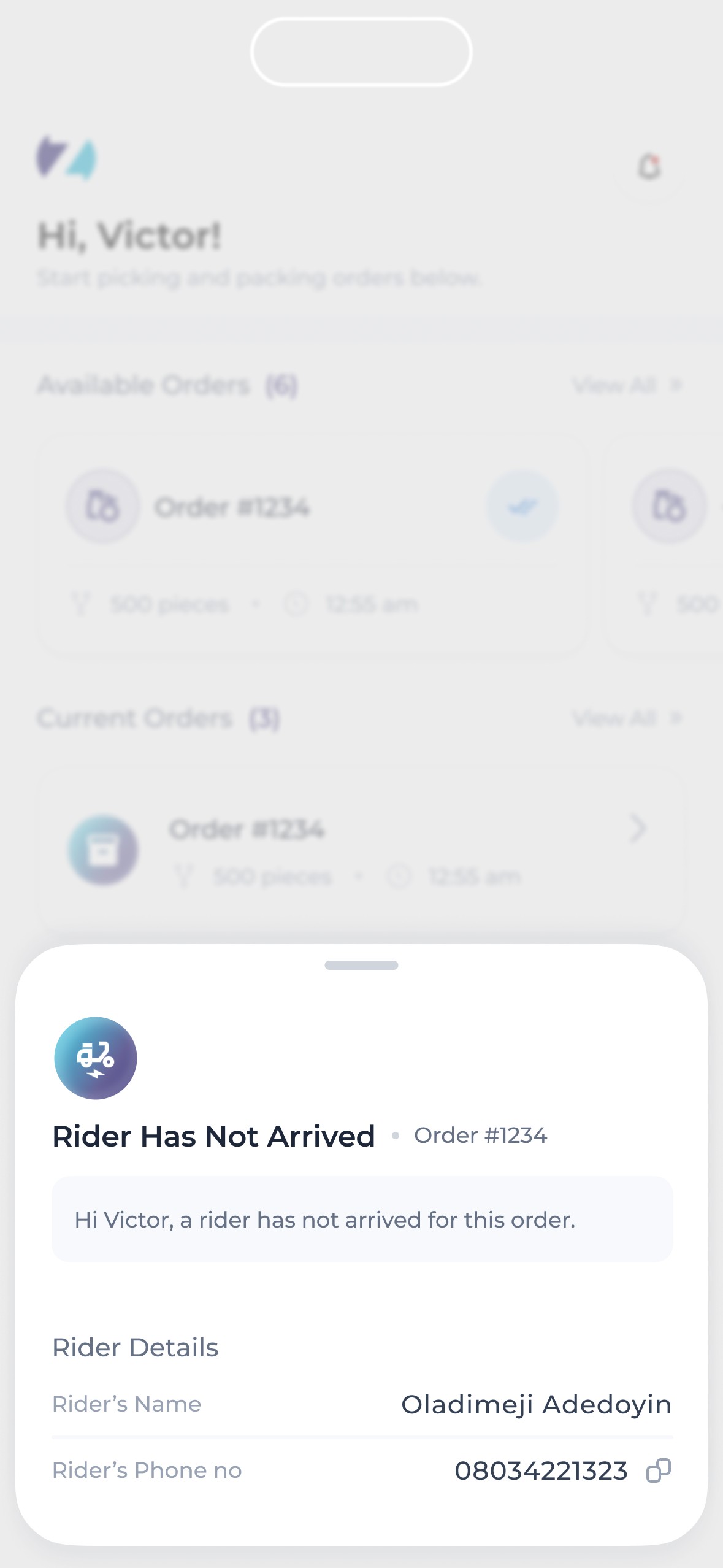
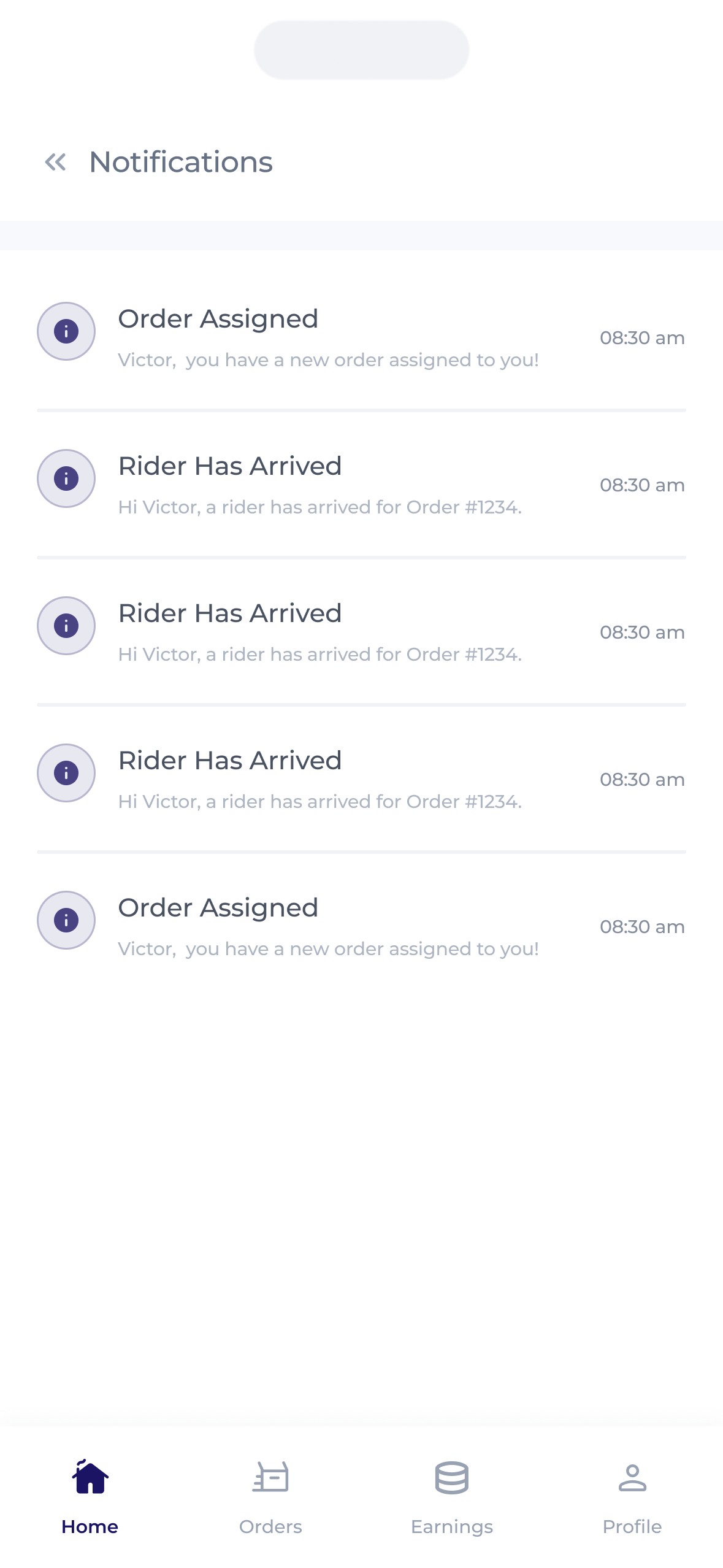
They also needed to be able to communicate with both the rider & the buyer.
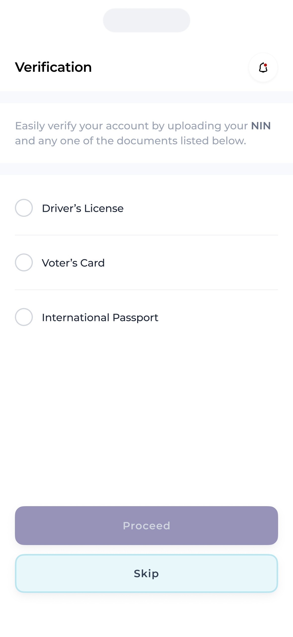
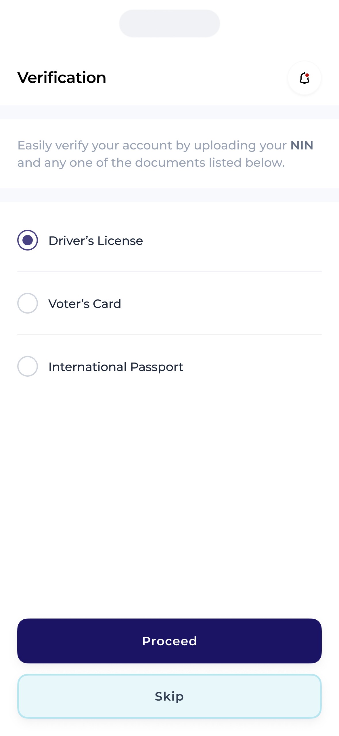
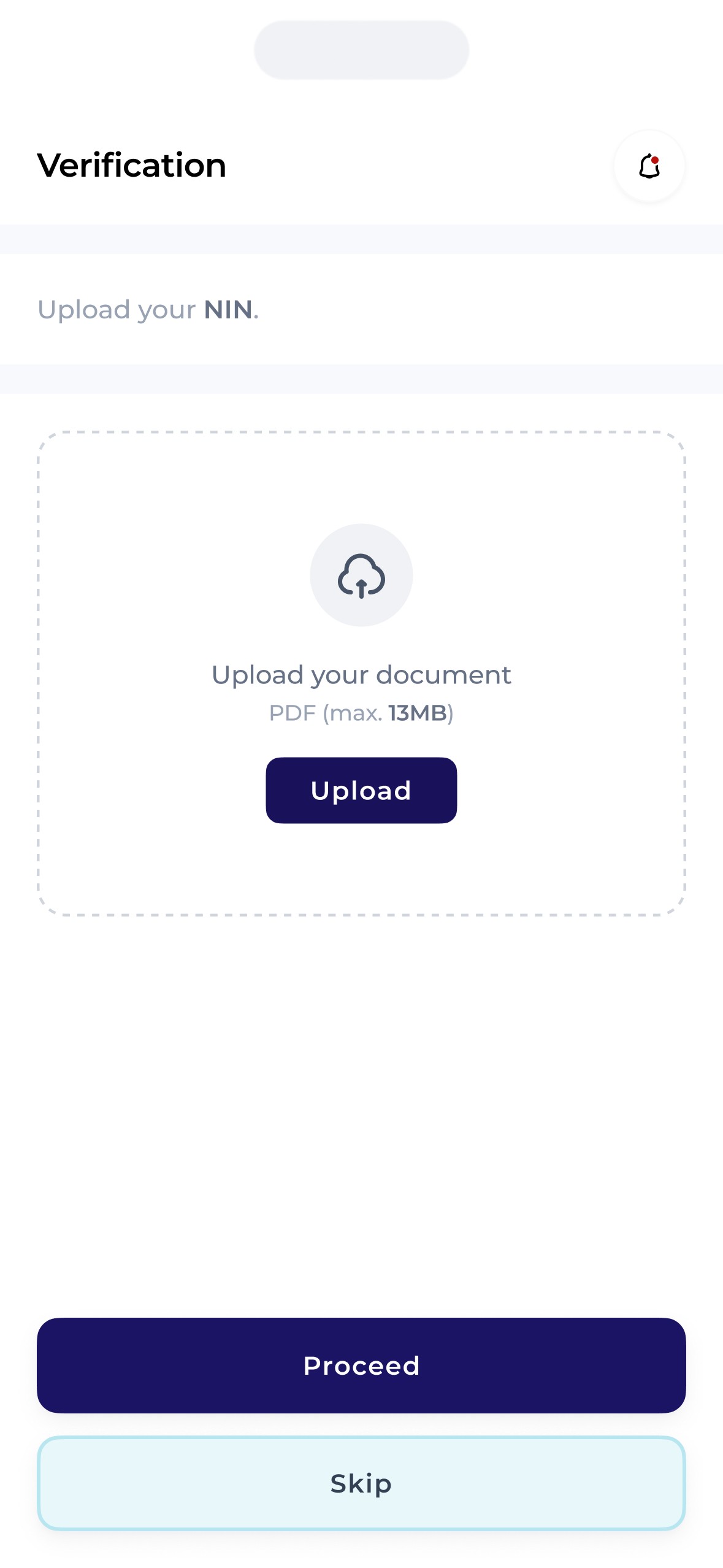
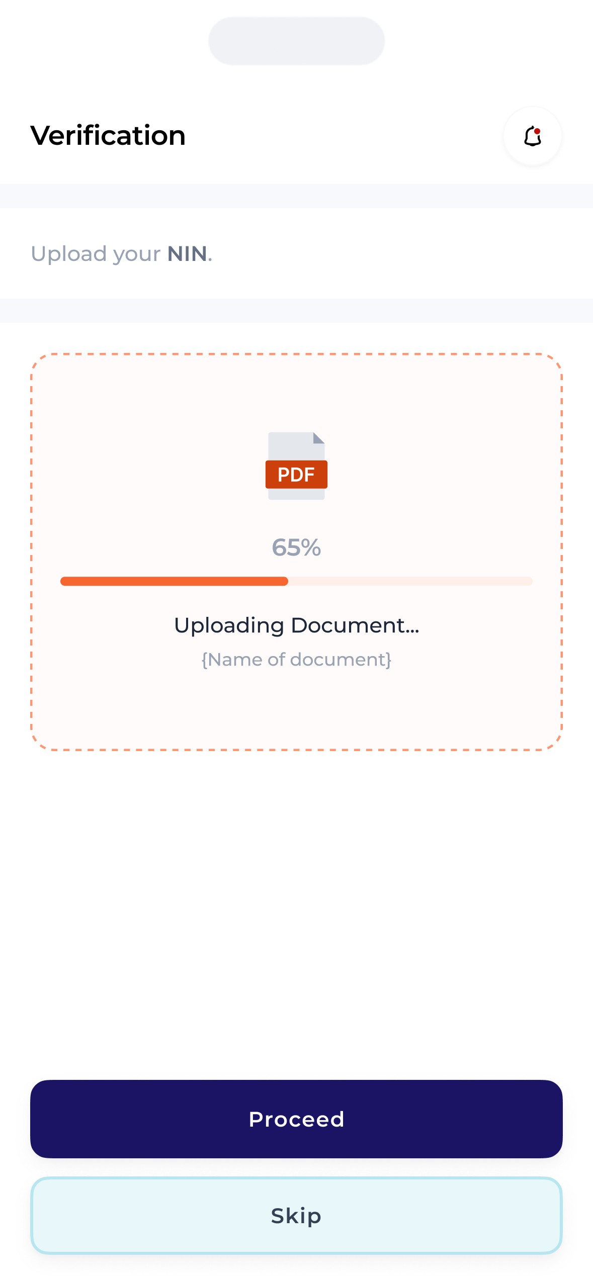
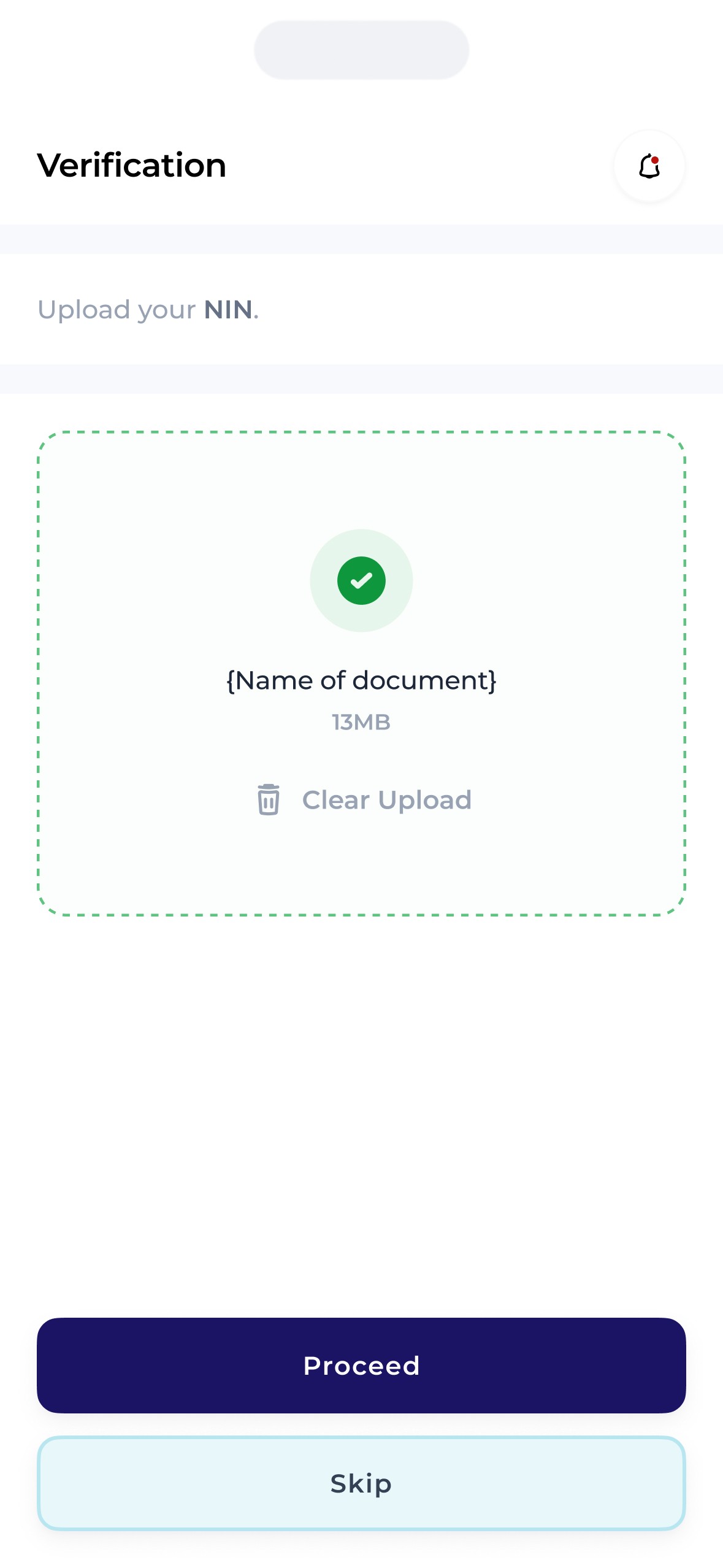
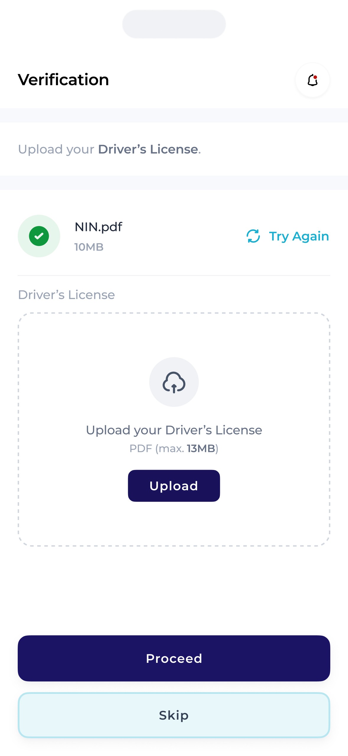
The kyc.
It was quite vital for the Zippi team to verify the identification of each user with the mantle of “shopper” for security reasons. To do this, we ensured that each intended /aspiring shopper had the ability to prove their identity both after Sign In and further in the flow.
Shoppers had to provide 2 means of identification 1 of which must be the government issued identification mandatory for every citizen – the National Identity Number, with the other being one of 4 others.
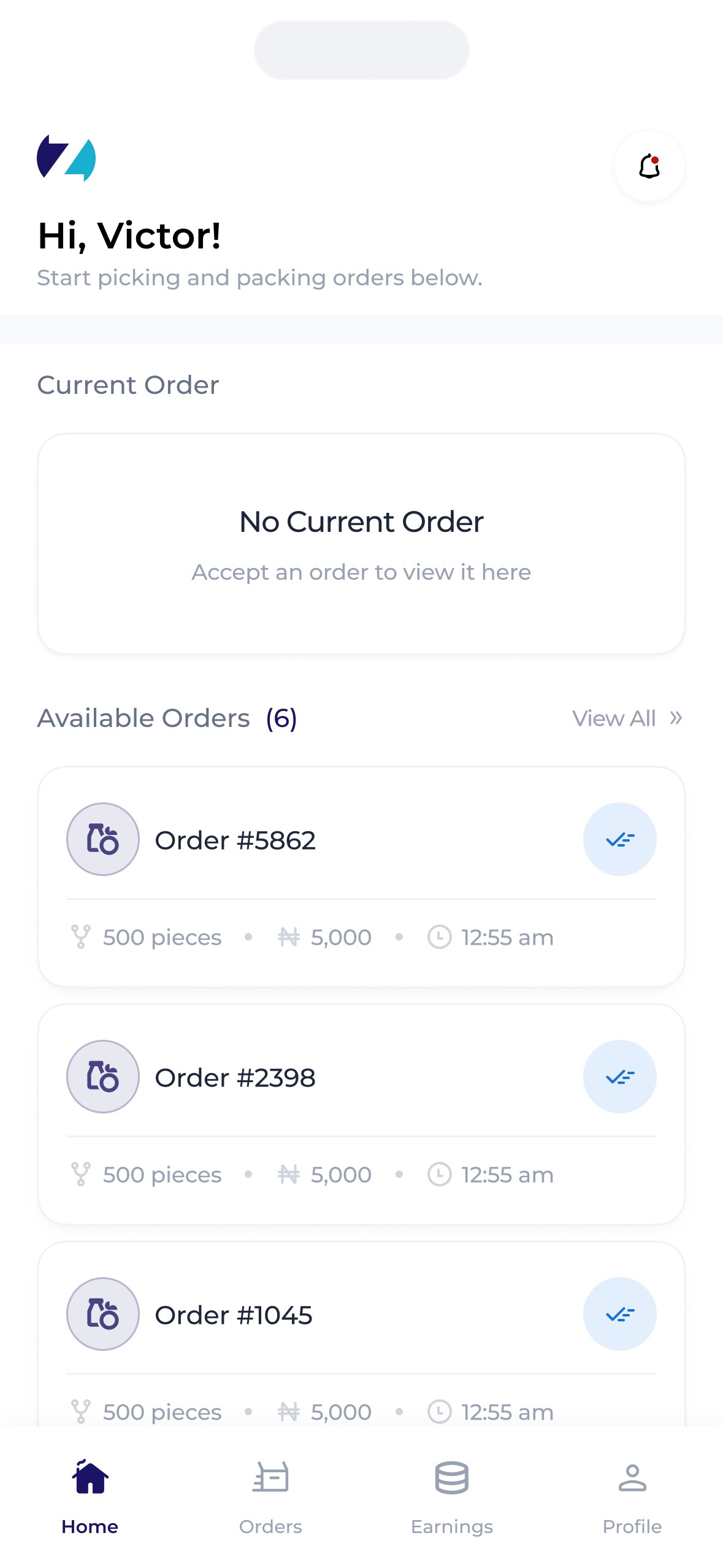
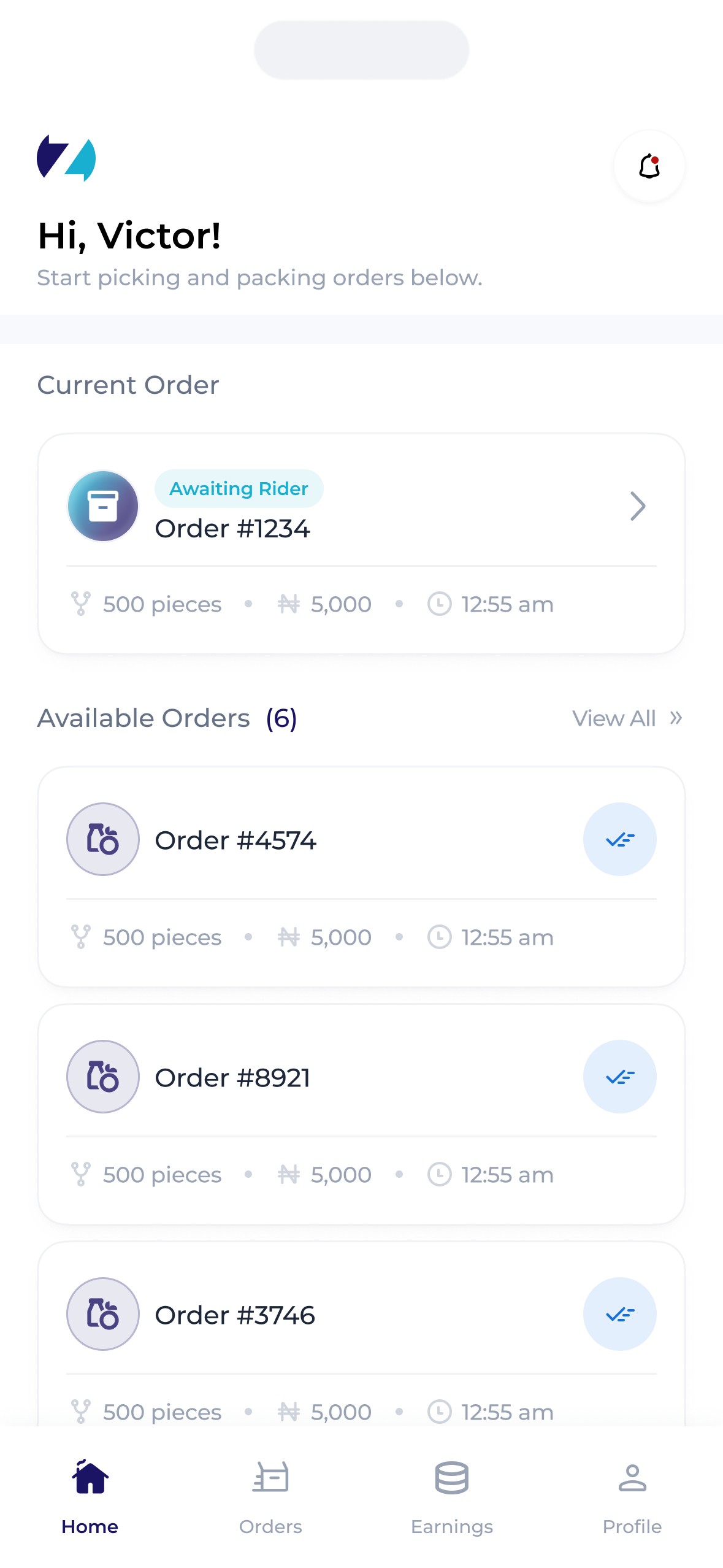
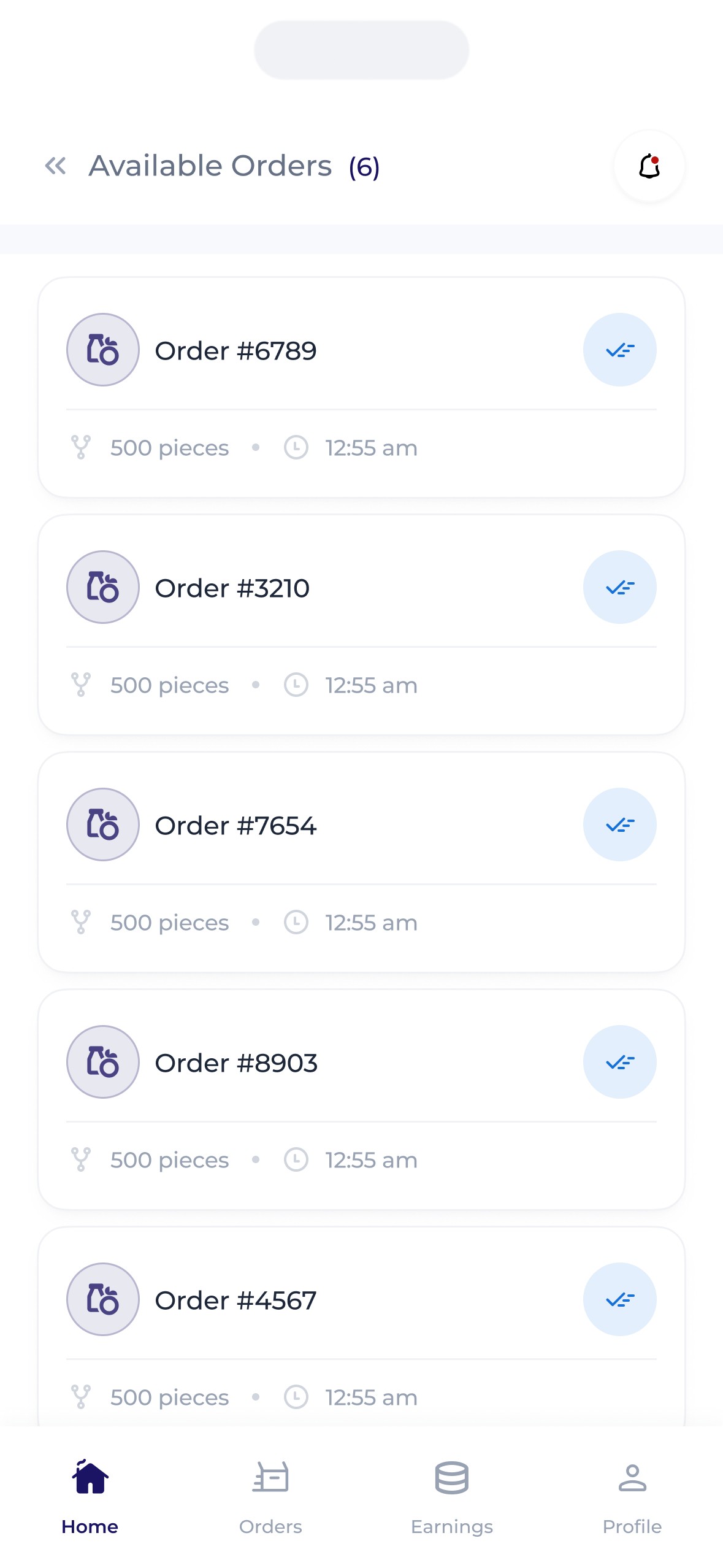
Home.
Zippi shoppers needed to be able to walk into any Zippi affiliated store to receive orders and shop, allowing them to earn on the go, anywhere.
A number of features were introduced to account for this –
Firstly, a search feature that allowed shopper search either for specific stores or for stores in specific locations was introduced, with a nifty addition. While this search feature was important, it was also vital to ensure that shoppers were available to pack orders they accepted. Thus, shoppers were allowed to select stores they were not close to (thereby allowing them view the available orders at that store) but were only able to accept orders when they were in the store themselves. This prompted shoppers to check for order availability in stores then head over to stores with high demand ensuring they get paid & orders get completed.
An availability toggle was also introduced. This allowed shoppers select when they're available to receive orders as there's a possibility of getting assigned orders when demand is high.
Confirmations.
Zippi shoppers needed to be able to walk into any Zippi affiliated store to receive orders and shop, allowing them to earn on the go, anywhere.
A number of features were introduced to account for this –
Firstly, a search feature that allowed shopper search either for specific stores or for stores in specific locations was introduced, with a nifty addition. While this search feature was important, it was also vital to ensure that shoppers were available to pack orders they accepted. Thus, shoppers were allowed to select stores they were not close to (thereby allowing them view the available orders at that store) but were only able to accept orders when they were in the store themselves. This prompted shoppers to check for order availability in stores then head over to stores with high demand ensuring they get paid & orders get completed.
An availability toggle was also introduced. This allowed shoppers select when they're available to receive orders as there's a possibility of getting assigned orders when demand is high.
Others
Here are some other screens that made it into development.